Beauty Unlocked
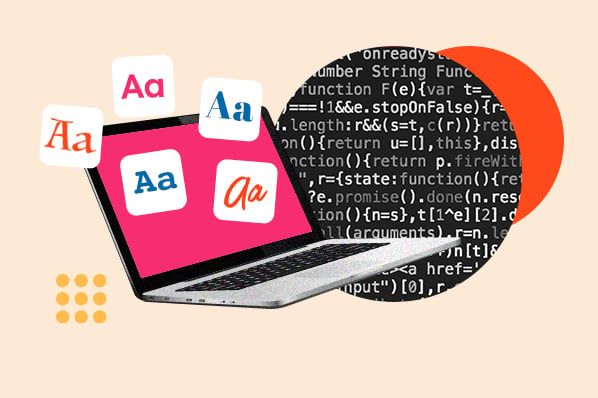
The 23 Best Web-Safe HTML & CSS Fonts
Jun
Web typography is basically hosting a dinner party where your guests show up on wildly different devices, browsers, and operating systems.
Some arrive in a brand-new iPhone. Others roll in on an office PC that still thinks 2016 was “recent.” A few are on Linux, and they’re here
because they enjoy configuring things.
If you want your text to look intentional everywhere, web-safe fonts are your reliable “I brought chips” friend:
not flashy, always shows up, never breaks the vibe. This guide covers the best web-safe HTML and CSS fonts (plus practical font stacks),
and shows you exactly how to use them without turning your CSS into a mystery novel.
What “web-safe” really means (and what it doesn’t)
A web-safe font is generally a font that’s pre-installed on many devices and common operating systems, so the browser can render it
without downloading anything extra. The big win is predictability: fewer layout surprises, fewer “why did the heading just reflow?” moments,
and faster first paint.
The honest truth: there’s no font that’s truly universal on every device. That’s why you’ll see the term “web-safe” used in two ways:
- Cross-platform classics that exist on a huge number of Windows/macOS machines (and often beyond).
- System fonts that are “safe” on a specific platform (like macOS/iOS), best used with smart fallbacks.
How to use web-safe fonts the right way
1) Always write a font stack (never bet the whole site on one font)
In CSS, you don’t “pick a font.” You rank fonts. Your browser tries the first option, then falls back to the next, and so on.
End your stack with a generic family like sans-serif, serif, or monospace so the browser always has a final
safe landing spot.
2) Use the right generic family
Generic families aren’t “fonts,” but they’re important: they tell the browser what type of font to use if it can’t find your specific choices.
This helps your design degrade gracefully instead of face-planting into a random default.
3) Match your fallbacks by shape, not by wishful thinking
If your first-choice font is narrow and tall, don’t fall back to something wide and chunky. That’s how you get awkward line breaks,
jumped buttons, and paragraphs that suddenly look like they ate a big lunch.
4) Don’t forget performance and accessibility
Web-safe fonts can be a performance win because you’re not downloading extra font files. They can also improve readability when you choose familiar,
legible faces and avoid decorative fonts for body copy.
The 23 best web-safe HTML & CSS fonts
Below are 23 popular web-safe fonts you’ll see across the web. Some are strong cross-platform picks; others are especially common on Mac and iOS.
The key is how you stack them.
1) Helvetica (sans-serif)
Clean, neutral, and quietly confident. Helvetica is a staple for modern design and brandingespecially on Apple ecosystems.
It’s a great “don’t distract from the content” choice.
Try this stack:
2) Arial (sans-serif)
Arial is the “works everywhere” MVP. If you need a safe default for UI and body text, Arial is hard to break.
It’s not trying to be the main characterand that’s exactly why it wins.
Try this stack:
3) Arial Black (sans-serif)
Bold, heavy, and attention-grabbinguseful for short headlines, badges, or punchy callouts. Not ideal for long paragraphs unless you enjoy shouting.
Try this stack:
4) Verdana (sans-serif)
Designed for screens, with generous spacing that stays readable at smaller sizes. Verdana is a great accessibility-friendly pick for body text.
Try this stack:
5) Tahoma (sans-serif)
Compact and crisp, Tahoma works well for UI labels, navigation, and forms. It’s tidy without being sterile.
Try this stack:
6) Trebuchet MS (sans-serif)
Friendly, slightly energetic, and surprisingly versatile. Trebuchet MS has personality without being goofygood for blogs and modern “human” brands.
Try this stack:
7) Impact (sans-serif)
Yes, it’s meme-famous. But Impact can also be useful for bold headlines and short, high-contrast display text.
Use it sparinglylike hot sauce.
Try this stack:
8) Gill Sans (sans-serif)
Classic and stylish, often seen on macOS. It’s great for editorial vibes and tasteful branding. Pair with safe fallbacks for non-Mac users.
Try this stack:
9) Times New Roman (serif)
The default serif legend. It’s familiar, widely available, and still useful for content-heavy pages, academic vibes, or when you want “classic.”
Try this stack:
10) Georgia (serif)
Georgia is a screen-friendly serif that reads beautifully online. It’s a popular choice when you want warmth and credibility without sacrificing legibility.
Try this stack:
11) Palatino (serif)
Elegant and readable, Palatino (often “Palatino Linotype” on Windows) brings a refined, bookish feelgreat for long-form content and portfolios.
Try this stack:
12) Baskerville (serif)
High-contrast and classy. Baskerville is excellent for headlines, pull quotes, and premium branding. For body text, watch sizes and line-height.
Try this stack:
13) Andalé Mono (monospace)
A clean monospace option that shows up in “core fonts” history and on many systems. Solid for code snippets and technical UI when available.
Try this stack:
14) Courier (monospace)
The typewriter classic. Courier (and Courier New) is common and instantly communicates “code,” “receipt,” or “retro.”
Great for snippetsless great for entire websites unless you’re going for that vibe on purpose.
Try this stack:
15) Lucida (monospace)
“Lucida” is a family with multiple variants. For web work, Lucida Console is a frequent monospace pick, and it’s designed to be legible on screens.
Try this stack:
16) Monaco (monospace)
A Mac-friendly monospace classic. Monaco is popular in developer tooling and looks great for code blocks. Back it up for non-Mac platforms.
Try this stack:
17) Bradley Hand (cursive)
A casual handwritten style, often seen on macOS. Fun for small accentslike a “note” calloutrather than critical UI or long paragraphs.
Try this stack:
18) Brush Script MT (cursive)
A dramatic script with strong personality. Use it for logos, special headings, or “event invitation” vibes. Use sparingly for readability’s sake.
Try this stack:
19) Luminari (fantasy)
Theatrical and decorative. Luminari is best as a display font for one-liners and special bannersnot for anything your users need to read quickly.
Try this stack:
20) Comic Sans MS (cursive)
Comic Sans is the internet’s most controversial comfort food. In the right context (kid-friendly content, informal notes, accessibility scenarios),
it can work. In the wrong context, it will become the only thing anyone talks about.
Try this stack:
21) Optima (sans-serif)
Elegant, clean, and slightly “premium.” Optima is especially common on Apple platforms and works well for beauty, wellness, and boutique brands.
Try this stack:
22) Didot (serif)
High-fashion editorial energy. Didot shines in large sizesthink magazine-style headlines, hero text, and logo-like typography.
For body copy, it’s usually too delicate.
Try this stack:
23) American Typewriter (serif)
Nostalgic and charming, with “vintage typewriter” vibes. Great for themed sections, pull quotes, or brand accentsjust keep it readable and restrained.
Try this stack:
Bonus: modern “system font” stacks for fast, native-looking UI
If your goal is a clean interface that feels native on each device (and loads fast), consider a system UI stack.
This doesn’t replace the font list aboveit’s a practical alternative for apps, dashboards, and content-heavy sites where speed matters.
System UI (general purpose)
Monospace UI (code blocks)
Common mistakes that make web-safe fonts look… not safe
- Skipping the generic family: always end with
sans-serif/serif/monospace. - Using decorative fonts for body text: scripts and fantasy fonts are headline-only territory.
- Forgetting line-height: many fonts need slightly different line-height to feel comfortable.
- Over-styling small text: thin weights + low contrast + tiny size = a readability crime scene.
- No testing: check at least one Windows browser, one Mac browser, and a mobile device before calling it “done.”
Conclusion
Web-safe fonts are still a smart move when you want reliability, performance, and fewer cross-device surprises. The trick isn’t finding a single
“perfect” fontit’s building a font stack that protects your design when the first choice isn’t available.
Start with a readable base (Arial, Verdana, Georgia, or a system-ui stack), choose a headline font with the right tone (Helvetica, Baskerville, Didot),
and keep decorative fonts on a short leash. Your users will thank youmostly by staying on your site instead of bouncing in confusion.
Real-world experiences: what actually happens when fonts meet the real internet
If you’ve ever shipped a design that looked perfect in your browser and then discovered it looked “slightly haunted” on someone else’s device,
welcome to typography reality. In real projects, font decisions aren’t just about tastethey’re about risk management.
One of the most common scenarios: a team chooses a beautiful web font for branding, then forgets that fallbacks have different widths.
On launch day, the headline wraps onto an extra line for a chunk of visitors, pushing the hero button below the fold. Nobody intended to create a
“scroll to find the call-to-action” scavenger hunt, but here we are. This is where web-safe fonts (or carefully selected, similar fallbacks) save you.
A sensible stack like Helvetica, Arial, "Segoe UI", sans-serif tends to keep spacing stable because the fonts are in the same “family vibe.”
Another classic: email templates. Email clients are famously stubborn. Many ignore advanced font loading, and some rewrite your CSS like it’s doing you a favor.
In that world, web-safe fonts aren’t optionalthey’re the only realistic way to keep typography consistent. Designers often land on Arial, Georgia,
or Times New Roman because these render predictably in the chaotic ecosystem of desktop Outlook, mobile apps, and webmail. A practical lesson here:
if your typography needs to work in email, don’t start with a fancy script font and hope for the best. Start with the safe stuff, then add personality
through layout, spacing, and color.
Accessibility testing brings its own set of “surprises.” Fonts that look stylish at 14px can become a strain at 16px when paired with low contrast
or tight spacing. Teams often discover that Verdana feels more readable for body text, especially for users who benefit from larger default settings.
It’s not that Verdana is “prettier”it’s that it’s engineered for clarity. That’s an experience many teams have: the best font on paper isn’t always
the best font for real humans reading real content under real conditions.
There’s also the brand-trust factor. Users make snap judgments about credibility based on visual polish, and typography is a loud signal.
If a site’s font fallback suddenly shifts to an unrelated default, the page can feel inconsistent or “off,” even if the content is great.
That’s why adding a couple of strategically chosen web-safe fallbacksplus a generic family at the endcan protect perceived quality.
You may never get a compliment for your font stack, but you’ll avoid the subtle penalty of looking broken.
Finally, there’s the “international characters” moment: the day someone’s name includes a character your main font doesn’t support.
Without a thoughtful stack, browsers can swap in a totally different font for just that character, producing a visual glitch that feels unprofessional.
Good fallbacks reduce that risk. Even if you’re using a web font, keeping web-safe fonts in the stack can help ensure those edge cases render cleanly.
The takeaway from all these real-world lessons is simple: typography isn’t just aestheticsit’s system design. Web-safe fonts and sensible stacks
are how you keep your layout stable, your content readable, and your brand consistent when the real internet shows up with all its quirks.
