
Hair Care
Belgium Week: Piet Stockmans Ceramics
Aug
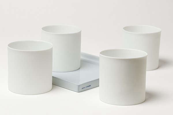
If minimalism had a heartbeat, it might sound like porcelain cooling after a kiln firing. That is the mood surrounding Piet Stockmans ceramics: calm, precise, slightly mysterious, and somehow more emotional the longer you look. During any celebration of Belgian design, Stockmans deserves a front-row seat. His work is not loud, trendy, or desperate for attention. It is the opposite. It has the confidence of someone who knows that true beauty does not need to wave its arms in the air like an inflatable car-lot mascot.
Piet Stockmans helped transform Belgian ceramics into something that feels both deeply traditional and unmistakably modern. His porcelain pieces balance discipline and poetry, industry and handwork, utility and art. They can live comfortably on a museum pedestal, on a Michelin-level table, or in a kitchen where someone is reheating coffee for the third time and pretending that is a personality trait. That range is part of what makes his work so compelling. He never treated porcelain as a fragile relic. He treated it as a living material with room for experimentation, elegance, and surprise.
This article explores why Studio Pieter Stockmans has become such a respected name in Belgian design, how the maker’s signature visual language took shape, why his famous blue remains so unforgettable, and what makes his ceramics feel timeless in an era addicted to quick visual noise. For anyone curious about Belgian ceramics, contemporary porcelain, or design that knows how to whisper instead of scream, Piet Stockmans is a name worth knowing.
The Quiet Power Behind Piet Stockmans Ceramics
Piet Stockmans built his reputation through a rare combination of artistic sensitivity and industrial discipline. Before founding his own studio, he spent decades working in porcelain design at Royal Mosa. That experience mattered. It gave him a deep understanding of production, function, stacking, handling, durability, and the practical realities of objects that people actually use. Plenty of artists can make a beautiful piece. Fewer can create one that feels good in the hand, behaves well on a table, and still carries a point of view.
That mix of art and usability became one of the defining strengths of his career. Rather than reject industrial knowledge, Stockmans absorbed it and then pushed against its limits. He understood repetition, but he was equally interested in variation. He respected the logic of tableware, but he also knew how to disrupt it. The result is a body of work that feels incredibly refined without ever becoming sterile. His ceramics are neat, but never boring. Orderly, but never cold.
One of the best ways to understand Piet Stockmans is to realize that he never treated porcelain as merely decorative. For him, it is a language. A bowl can speak through proportion. A cup can speak through touch. A plate can speak through the space it leaves empty. In his hands, restraint becomes expressive. That is a difficult trick. Many designers aim for simplicity and end up with emptiness. Stockmans aims for simplicity and arrives at tension, balance, and atmosphere.
From Factory Logic to Studio Freedom
Why his early career mattered
Stockmans’ long industrial design background shaped everything that came later. His time at Royal Mosa taught him how porcelain behaves under pressure, both literally and creatively. He learned what mass production can do well and where it starts to flatten personality. That knowledge gave him a stronger foundation than designers who approach ceramics only from the art side. He understood systems, but he never wanted to become trapped inside them.
That tension led to one of the most interesting chapters in his story: the shift from large-scale industrial production to an independent studio practice focused on hard-paste porcelain, limited series, and handmade precision. When he founded Studio Pieter Stockmans in 1987, he did not simply start making “nicer plates.” He created a place where craftsmanship, experimentation, and material research could drive the work. The studio became a laboratory for Belgian porcelain design, a place where function still mattered but was no longer the only boss in the room.
The genius of combining art and design
What separates Piet Stockmans ceramics from more generic luxury tableware is that the work lives in two worlds at once. It belongs to design because it is useful, considered, and built around daily rituals. It belongs to art because it carries conceptual weight, visual rhythm, and an unmistakable personal language. That dual identity has allowed Stockmans to appeal to chefs, collectors, architects, museum curators, and ordinary design lovers who just want their coffee cup to feel a little less depressing on a Monday morning.
His pieces often resist unnecessary ornament. Instead of relying on busy surface patterns, he lets form do the work. Curves, edges, shadows, translucency, and negative space become the decoration. This is not a maximalist universe. No one here is shouting through twelve colors and a gold rim the size of a small highway. The drama is quieter. It lives in contour, repetition, and slight shifts that reward attention.
Stockmans Blue: The Color That Became a Signature
No discussion of Piet Stockmans is complete without talking about blue. More specifically, the soft, distinctive shade often referred to as Stockmans Blue. It is not the kind of blue that barges into a room and announces itself. It is subtler than that. It can look airy, watery, powdery, or almost like a memory of blue rather than blue at full volume. That subtlety is exactly why it works.
In ceramic design, color can easily become either too decorative or too flat. Stockmans found a middle ground. His blue feels integrated into the porcelain rather than merely placed on top of it. It interacts beautifully with white surfaces, giving his tableware a sense of movement without making it visually heavy. Some pieces use blue sparingly, almost like a breath. Others lean into it more fully, allowing the tone to carry emotional weight. Either way, the effect is unmistakable.
This signature color helped build brand recognition, but it also did something more important: it made the work emotionally legible. Even people who do not know the backstory can sense that the blue means something. It introduces softness into the precision of porcelain. It keeps minimalism from becoming clinical. It gives the work a pulse.
That is one reason Stockmans’ ceramics photograph so beautifully while still feeling better in person. On a screen, the blue looks elegant. In real life, it becomes atmospheric. It shifts with light, glaze, and angle. It invites slower looking. Good design often works that way. The first glance attracts you. The second glance explains why you stayed.
Why Hard-Paste Porcelain Still Feels Special
A material with discipline
Hard-paste porcelain has a reputation for refinement, and for good reason. It is strong, luminous, and demanding. It does not forgive carelessness. That makes it the perfect medium for a designer like Stockmans, whose work depends on exactness, subtle variation, and material honesty. In the wrong hands, porcelain can become overly precious. In the right hands, it becomes almost architectural.
Stockmans understands that tension. His ceramics often look delicate, yet they are grounded in technical control. The rims are crisp. The profiles are balanced. The surfaces feel intentional rather than overworked. Even when pieces appear effortless, they carry the evidence of real discipline. This is one reason serious collectors and design professionals continue to respect the studio. The work does not hide behind a romantic craft story. It earns admiration through execution.
Why the material matches the message
Porcelain also suits the philosophy behind the work. It is a material that can hold contradiction: strength and fragility, utility and symbolism, whiteness and color, smoothness and irregularity. Stockmans uses those oppositions brilliantly. A bowl can feel light yet grounded. A vase can look almost industrial in shape but poetic in finish. A stack of repeated forms can suggest order while still preserving individuality. That is part of the intellectual pleasure of his work. It rewards both use and interpretation.
Piet Stockmans and the Belgian Design Identity
Belgian design has long been admired for its restraint, material intelligence, and refusal to confuse luxury with excess. In that landscape, Piet Stockmans fits naturally. His ceramics reflect qualities that many people associate with the best of Belgian creative culture: understatement, craftsmanship, seriousness of purpose, and a willingness to let materials speak for themselves.
But Stockmans is not important merely because he fits a national aesthetic. He helped shape it. His work gave Belgian porcelain design an international voice that felt contemporary without abandoning heritage. He linked old ceramic traditions to modern forms. He treated domestic objects as cultural objects. He showed that tableware could carry artistic depth without becoming unusable theater.
That balance matters in a world flooded with novelty. So much contemporary design is optimized for the first photo and forgotten by the second season. Stockmans works differently. His ceramics are built for longevity. They feel modern, but not chained to fashion. They are elegant, but not fussy. They do not beg to be noticed. They quietly become unforgettable.
Why Chefs, Collectors, and Museums Pay Attention
The restaurant connection
Chefs are often among the sharpest judges of tableware because they understand presentation, weight, pacing, and how food interacts with form. Stockmans’ porcelain has earned admiration in fine dining because it supports the meal without stealing the show. That is harder than it sounds. A plate must frame color, texture, and scale while still contributing to the total experience. Too plain, and it disappears. Too flashy, and it starts behaving like a diva in a supporting role.
Stockmans gets the balance right. His plates and bowls often feel like quiet stages for food. The shapes are thoughtful, the surfaces responsive, and the overall effect refined without stiffness. This is one reason his work has been embraced by high-end culinary settings. The ceramics elevate the table through intelligence rather than spectacle.
The collector appeal
Collectors are drawn to the same qualities, but from a different angle. They value the way Stockmans moves between series, installations, one-off objects, and domestic forms. His archive does not feel repetitive even when repetition appears within the work. Instead, it feels like a sustained investigation into what porcelain can be. Color, scale, grouping, and spatial rhythm all become part of that investigation.
For museums, the appeal is equally clear. Stockmans occupies a productive intersection between craft, design, and contemporary art. He represents not just technical excellence, but a broader conversation about how functional objects carry cultural meaning. That is why his work fits naturally in serious collections. It speaks to design history, ceramic innovation, and modern living all at once.
What Makes Studio Pieter Stockmans Feel Contemporary Today
One of the smartest things about Studio Pieter Stockmans is that it never seems trapped in nostalgia. Yes, the work respects ceramic history. Yes, the studio is rooted in handcraft and material tradition. But the overall identity still feels current. Part of that comes from the clean visual language. Part comes from the studio’s willingness to collaborate, evolve, and keep testing the material. And part comes from the fact that the values behind the work are especially relevant now.
People increasingly want objects that last. They want fewer things, better made. They want a home to feel intentional instead of overfilled. They want design that can survive trend cycles without looking exhausted six months later. Stockmans makes sense in that context. His ceramics speak to sustainability through longevity, to luxury through craftsmanship, and to beauty through usefulness.
In other words, the work feels contemporary not because it chases the present, but because it understands what the present is hungry for.
The Experience of Living With Piet Stockmans Ceramics
Here is where the conversation becomes more personal, because the experience of Piet Stockmans ceramics goes beyond biography, design awards, and museum credibility. The real magic happens when these objects enter daily life. A Stockmans bowl on a shelf changes the room even when it is empty. A porcelain cup makes coffee feel slightly more civilized, which is no small public service. A plate with the faint wash of Stockmans Blue can make a simple lunch look like you briefly got your life together.
There is also something deeply calming about the work. The pieces encourage slower attention. You notice the edge of a rim, the softness of a glaze, the way light settles across a white surface and then drifts into blue. The ceramics ask you to look more carefully, and in doing so they subtly change the pace of the moment. That may sound dramatic for a plate, but good design often works through tiny corrections to everyday life.
Imagine walking into the studio environment in Genk, where the history of industry meets the fragility of porcelain. You move from one object to the next and start noticing how repetition becomes rhythm. Rows of vessels no longer feel like copies; they feel like variations in a quiet visual sentence. You see how one curve tightens, another opens, another catches light differently. The experience is not overwhelming. It is immersive in a gentler way. Instead of trying to impress you through volume, the work draws you inward through concentration.
That same feeling can follow the pieces home. Stockmans ceramics do not dominate a room. They tune it. On a dining table, they create a mood of order and ease. In a kitchen, they bring a sense of ritual to ordinary tasks. On open shelving, they act almost like punctuation marks in space, giving the eye a place to rest. They are useful objects, yes, but they also shape atmosphere.
This is especially true because the work does not rely on gimmicks. There are no visual stunts begging for applause. No frantic attempt to prove how creative everyone is. Instead, there is proportion, restraint, craftsmanship, and trust in the material. That trust is contagious. It makes the user relax a little. You feel that the object knows what it is doing, which is more than can be said for many people before their second cup of coffee.
There is an emotional dimension, too. Porcelain carries memory unusually well. It is the material of meals, ceremonies, gifts, inheritance, and domestic routine. Stockmans understands that emotional charge, and his work makes room for it. The pieces feel contemporary, but they also feel capable of lasting through years of use, changing homes, changing seasons, and changing tastes. They are not disposable expressions of a trend. They are objects that invite attachment.
That may be the strongest reason Piet Stockmans matters during Belgium Week or any other week. His ceramics remind us that design does not have to be loud to be memorable, and that beauty becomes more convincing when it is woven into life rather than staged outside it. In a culture obsessed with instant reactions, his work asks for something better: attention, use, and time.
Final Thoughts on Belgium Week: Piet Stockmans Ceramics
Piet Stockmans stands as one of the most compelling figures in Belgian ceramics because he bridges worlds that are too often separated: art and design, industry and handcraft, function and feeling. His porcelain proves that restraint can be expressive, that utility can be beautiful, and that a signature style does not need visual noise to be memorable.
For readers exploring Belgium Week: Piet Stockmans Ceramics, the real takeaway is simple. This is not just a story about plates, bowls, or vases. It is a story about what happens when a designer spends a lifetime listening closely to one material and keeps finding new things to say with it. From Royal Mosa to Studio Pieter Stockmans, from white porcelain to the soft pulse of Stockmans Blue, his work offers a master class in clarity, patience, and design intelligence.
And honestly, in a world full of objects trying very hard to be interesting, there is something refreshing about ceramics that simply are.
SEO Tags

