Hair Care
Are Grid Walls the New Gallery Walls? Designers Weigh In
Jun
Grid walls are stepping into the spotlight, bringing symmetry, calm, and a polished designer look to the same blank walls where gallery walls once ruled with delightful chaos.
The Gallery Wall Had a Great RunBut the Grid Wall Is Having a Moment
For years, the gallery wall was the decorating equivalent of a confident dinner guest: expressive, layered, full of stories, and occasionally taking up more space than expected. It allowed homeowners to mix family photos, thrifted oil paintings, travel prints, postcards, mirrors, children’s artwork, and that one oddly charming sketch bought on vacation after two iced coffees and a burst of optimism.
But lately, a cleaner cousin has entered the room: the grid wall. Instead of mixing frame sizes and art styles in a loose arrangement, a grid wall uses identical or closely coordinated frames arranged in neat rows and columns. Think equal spacing, crisp alignment, matching mats, and the satisfying feeling of seeing everything line up perfectly. It is the wall decor version of a freshly organized drawer.
So, are grid walls the new gallery walls? Designers seem to agree on one thing: grid walls are not replacing gallery walls entirely, but they are becoming a favorite alternative for homeowners who want personality without visual noise. They offer structure in a design world that is currently obsessed with personal expression, layered rooms, vintage finds, and collected interiors. In other words, the grid wall is not boring. It is simply well-behaved.
What Is a Grid Wall?
A grid wall is a symmetrical wall display made from multiple framed pieces arranged in a precise pattern. Most often, the frames are the same size, color, and finish. The artwork may be a series of black-and-white photographs, botanical prints, abstract studies, family portraits, travel images, or even pressed flowers. The magic comes from repetition.
Unlike a traditional gallery wall, which often relies on contrast and variation, a grid wall relies on rhythm. Each frame acts like a note in a visual melody. Alone, one frame may feel simple. Together, nine, twelve, or sixteen frames create impact without shouting across the room like a sofa in neon velvet.
Grid Wall vs. Gallery Wall: The Key Difference
A gallery wall is typically more organic. It may include different frame sizes, art styles, textures, and shapes. It feels collected over time and often looks best when it has a bit of imperfection. A grid wall, on the other hand, is planned from the beginning. It is measured, balanced, and intentionally repetitive.
Both styles can be beautiful. The question is not which one is “better,” but which one works best for your space, your art, and your patience level. If measuring makes you twitch, a loose gallery wall may be kinder. If crooked frames haunt your dreams, welcome to the grid.
Why Designers Are Embracing Grid Walls Now
Interior design has been moving away from sterile, generic rooms and toward spaces that feel personal, layered, and lived-in. At the same time, many homeowners still crave order. That is where grid walls shine. They allow people to display meaningful art and photographs while keeping the overall room calm and intentional.
Designers often recommend grid walls when a room already has plenty of pattern, texture, or color. If your living room includes patterned drapery, a bold rug, sculptural lighting, and a bookshelf that looks like it has a PhD in personality, a traditional gallery wall might push the room from “interesting” to “please send help.” A grid wall can provide the personal touch without adding visual clutter.
They Bring Order to Maximalist Interiors
Maximalism is not going anywhere, but today’s version is more curated than chaotic. People want layered rooms, but they also want the layers to make sense. A grid wall adds a sense of architecture to a room. It frames the personality rather than letting it spill all over the wall like confetti after a craft-store explosion.
They Make Personal Photos Look Sophisticated
Family photos can be tricky. Displayed casually, they sometimes feel cluttered. Displayed in a grid with matching frames and consistent editing, they suddenly look editorial. Black-and-white portraits in simple frames can turn a hallway, staircase, or dining room into a refined family archive.
This is one reason grid walls feel so fresh. In a world where thousands of photos live trapped inside phones, printing and framing personal images feels almost rebellious. A grid wall says, “Yes, these memories matter enough to come out of the cloud.” Very dramatic, very wholesome.
They Work in Almost Any Design Style
A grid wall can feel modern, traditional, coastal, transitional, farmhouse, minimalist, or glam depending on the frame and artwork choices. Thin black frames feel graphic and contemporary. White frames with wide mats feel airy and coastal. Warm wood frames add softness. Brass or gold frames bring polish and formality.
The layout is structured, but the mood is flexible. That versatility is one reason designers like using grid walls in entryways, dining rooms, stairwells, home offices, bedrooms, and long hallways.
Where Grid Walls Work Best
Grid walls are especially effective in spaces that need a focal point but cannot handle too much visual movement. They are also excellent for walls with awkward proportions because the repeated shapes help create order.
Living Rooms
Above a sofa, a grid wall can create the same impact as one oversized artwork. The key is scale. The entire arrangement should feel connected to the furniture below it. A tiny grid floating above a large sectional will look like it got lost on the way to a powder room. Aim for a display that fills a generous portion of the wall and visually relates to the width of the sofa.
Dining Rooms
Dining rooms love symmetry. A grid of botanical prints, vintage food photography, abstract drawings, or family images can create a polished backdrop for meals. It also gives dinner guests something to look at when conversation briefly collapses into chewing.
Hallways
Hallways are natural homes for grid walls because they often have long, narrow stretches of blank wall. A series of evenly spaced frames can turn a pass-through space into a mini gallery. Family photos, travel photography, architectural prints, or black-and-white landscapes work especially well here.
Staircases
Staircases are famous for making homeowners ask, “How do I decorate this wall without needing a geometry degree?” A grid wall can work beautifully if the frames follow the angle of the stairs or if the display is placed on a landing wall. Consistency in frame size and spacing helps prevent the arrangement from looking scattered.
Home Offices
A grid wall behind a desk can add polish to video calls and make the workspace feel intentional. Abstract prints, typography, architectural sketches, or serene photography can create a professional background without screaming, “I decorated this five minutes before a meeting.”
How to Create a Grid Wall That Looks Designer-Level
The beauty of a grid wall is also its challenge: precision matters. A gallery wall can forgive a little imbalance. A grid wall cannot. If one frame is slightly off, your eye will spot it immediately, because apparently our brains are secretly tiny building inspectors.
1. Choose the Right Number of Frames
Common grid wall layouts include 2-by-2, 3-by-3, 3-by-4, 4-by-4, or long horizontal rows. The right number depends on the size of the wall, the room, and the scale of the frames. A small powder room may only need four frames. A large stairwell or living room wall may need twelve or sixteen.
Before buying anything, measure the wall and decide how much space the full arrangement should occupy. Include the frame dimensions and the gaps between each frame in your calculation. This step is not glamorous, but neither is returning twelve frames because the math had “creative differences.”
2. Keep Spacing Consistent
Consistent spacing is the soul of a successful grid wall. Many designers recommend spacing frames about two to three inches apart, depending on frame size and wall scale. Smaller frames often look better with tighter spacing, while larger frames may need slightly more breathing room.
The gap should be the same horizontally and vertically. Do not guess. Use a tape measure, level, painter’s tape, and paper templates if needed. The wall will know if you lied.
3. Use Matching Frames for Maximum Impact
Matching frames are what give grid walls their clean, gallery-like presence. Choose a frame finish that complements the room’s existing palette. Black frames add definition. White frames disappear softly into pale walls. Wood frames bring warmth. Metal frames can add a crisp, refined edge.
Mats are equally important. Wide mats can make inexpensive prints feel more expensive and give small images room to breathe. If you are using family photos, consistent matting can make the collection feel cohesive even if the photos were taken years apart.
4. Edit the Art Before You Hang
Grid walls work best when the artwork shares a common theme, palette, or visual style. That does not mean everything has to match perfectly. It does mean the pieces should feel like they belong in the same conversation.
Try a series of black-and-white family photos, sepia travel shots, minimalist line drawings, coastal photography, pressed botanicals, antique maps, vintage fashion sketches, or abstract studies in related colors. If every piece is fighting to be the star, the grid will look less like a designer moment and more like a very organized argument.
5. Plan the Layout on the Floor First
Before touching the wall, arrange the frames on the floor. This lets you test the order, balance, and spacing without creating a drywall crime scene. Take a photo of the final floor layout so you can reference it while hanging.
For extra accuracy, make paper templates the same size as the frames and tape them to the wall. Mark the hanger location on each template. This method may feel fussy, but it saves time, stress, and the need to strategically place a plant in front of accidental holes.
When a Traditional Gallery Wall Still Wins
Grid walls may be trending, but gallery walls are far from finished. In fact, the traditional gallery wall remains one of the best ways to show off personality, history, and creative confidence. A loose gallery wall is ideal when your art collection includes different sizes, mediums, eras, and moods.
If you have a vintage oil painting, a framed concert poster, a tiny landscape, a ceramic wall piece, a family silhouette, and a weird little flea-market portrait that looks like it knows secrets, do not force them into a grid. Let them mingle. A gallery wall thrives on variety.
Gallery Walls Feel Collected
The best gallery walls rarely look purchased all at once. They feel gathered over time. They may include personal mementos, thrifted pieces, inherited art, travel finds, and objects that mean something to the homeowner. This layered quality creates warmth and conversation.
Gallery Walls Suit Eclectic Homes
If your style leans bohemian, vintage, traditional, cottage, maximalist, or artistic, a freeform gallery wall may suit your home better than a strict grid. The variation can echo other collected elements in the room, such as mixed textiles, antique furniture, patterned wallpaper, or colorful accessories.
Gallery Walls Are Easier to Expand
A grid wall is usually planned as a complete composition. Adding one more piece later can disrupt the structure. A traditional gallery wall is more forgiving. You can build it slowly, adding art as you find it. This makes it ideal for people who like their homes to evolve instead of arriving fully assembled like a furniture catalog with a mortgage.
Designer Verdict: Grid Walls Are Not Replacing Gallery Walls
The real answer is more nuanced than “grid walls are in” and “gallery walls are out.” Designers are not abandoning gallery walls. They are simply using grid walls more often when a room calls for symmetry, calm, or visual discipline.
Think of the grid wall as the tailored blazer of wall decor. Think of the gallery wall as the vintage leather jacket. Both are stylish. Both can be timeless. You just would not wear them to every occasion.
A grid wall is best when you want a clean, classic, polished look. A gallery wall is best when you want a layered, expressive, collected look. The smartest choice depends on the room’s architecture, the furniture, the art, and the feeling you want to create.
Common Grid Wall Mistakes to Avoid
Hanging the Frames Too High
Art should generally connect to the furniture and people in the room. If your grid is floating near the ceiling, it will feel disconnected. Above a sofa, bed, or console, keep the arrangement visually anchored to the piece below it.
Using Frames That Are Too Small
Small frames can work, but only when grouped in enough quantity to create presence. Four tiny frames on a huge wall will look timid. If the wall is large, choose larger frames or increase the number of pieces.
Choosing Images With No Relationship
Random images can make a grid wall feel cold or confusing. The structure may be orderly, but the content still needs emotional or visual connection. Choose a theme, color palette, subject matter, or editing style to unify the display.
Skipping the Measuring Stage
This is the big one. A grid wall depends on alignment. Even spacing and straight lines are not optional. Use a level, measure twice, and resist the dangerous confidence of “I can eyeball it.” History has not been kind to eyeballing.
Fresh Grid Wall Ideas for Modern Homes
Black-and-White Family Portrait Grid
Convert family photos to black and white, print them in the same size, and place them in matching frames with white mats. The result feels personal but polished, especially in hallways, staircases, or living rooms.
Botanical Print Grid
Botanical prints are timeless and work beautifully in bedrooms, dining rooms, kitchens, and sunrooms. Choose vintage-style illustrations for a traditional look or simple pressed plants for something more organic and modern.
Travel Photography Grid
Instead of letting vacation photos disappear into your camera roll, create a grid of landscapes, doors, architectural details, or street scenes from favorite trips. Keep the editing style consistent so the display feels curated.
Children’s Art Grid
Children’s artwork can look surprisingly chic when framed in matching frames. Select pieces with similar colors or rotate the display seasonally. It gives kids pride of place without turning the refrigerator into a paper avalanche.
Abstract Color Study Grid
For a contemporary room, use a series of abstract prints in a tight palette. This works especially well above a console, in a dining room, or in a home office where you want energy without chaos.
Personal Experience: What Living With a Grid Wall Actually Teaches You
After working with grid-wall concepts in real homes, one lesson becomes obvious: the grid looks simple only after the hard decisions are done. At first glance, it seems like the easiest wall decor idea in the world. Buy matching frames, hang them in rows, become the sort of person who owns linen napkins. Done. But the process quickly reveals that simplicity requires discipline.
The first experience many people have is the measuring stage, also known as the moment confidence leaves the body. A grid wall is not forgiving in the same way a casual gallery wall can be. With a loose gallery arrangement, a slightly imperfect placement can feel charming. With a grid wall, one crooked frame looks like it is trying to escape. The best approach is to slow down and create a full plan before hanging anything. Paper templates are not just helpful; they are sanity insurance.
The second lesson is that the art matters more than expected. Because the frames are identical, the images inside them become the emotional engine of the display. A grid of random prints may look tidy, but it can also feel flat. A grid of meaningful images feels completely different. Family photos from different years, travel images from places that changed you, sketches from a favorite artist, or botanical prints that connect to the garden outside can all give the grid warmth.
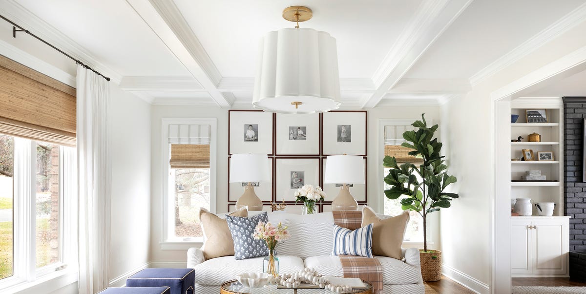
One of the most successful examples is a hallway grid of black-and-white family photos. The homeowner wanted something personal but not visually messy. The solution was twelve identical frames, each with a wide white mat and a candid family photograph. The photos were not overly posed. One showed muddy shoes after a hike. Another captured a child laughing at a birthday table. Another showed grandparents holding hands. The grid made the wall elegant, but the images kept it human.
Another memorable example involved a home office. The room had dark built-in shelves, a patterned rug, and a lot of books. A traditional gallery wall would have competed with everything else. Instead, a six-frame grid of quiet abstract line drawings gave the wall structure and breathing room. The office instantly felt more complete, and the owner joked that it made video calls look “accidentally professional.” That is a very specific kind of victory.
Grid walls also teach restraint. It is tempting to keep adding frames, especially when the first few look good. But more is not always better. Sometimes a 3-by-3 grid is stronger than a 4-by-4. Sometimes four oversized frames are more powerful than twelve small ones. The wall, the furniture, and the room’s architecture should decide the scalenot the sale section at the frame store.
The biggest surprise is how calming a grid wall can be. In busy homes, visual order has emotional value. A hallway full of family photos might sound chaotic, but when those photos are edited, framed, and aligned, the result can feel peaceful. It gives memories a structure. It turns everyday life into something honored, not just stored.
That said, grid walls are not for every personality. People who love constant rearranging may find them too fixed. Collectors who enjoy mixing antique frames, odd shapes, and unexpected objects may feel limited by the format. For them, a traditional gallery wall is probably still the better match. The best interiors are not about obeying trends. They are about choosing the design language that fits the people who live there.
In practice, the grid wall works best when it balances precision with feeling. Measure carefully, but choose art with soul. Keep the frames consistent, but let the images tell a story. Make the spacing exact, but do not make the wall emotionally sterile. A great grid wall should look polished from across the room and become more personal the closer you get.
Conclusion: The Grid Wall Is the Gallery Wall’s Polished Sibling
So, are grid walls the new gallery walls? Yes and no. Grid walls are absolutely having a design moment because they offer symmetry, sophistication, and calm. They are especially appealing in homes that already have plenty of pattern, color, or texture and need a wall display that feels intentional rather than busy.
But gallery walls are not disappearing. They remain one of the most personal and expressive ways to decorate a home. The rise of grid walls simply gives homeowners another tool. If a gallery wall is storytelling with jazz hands, a grid wall is storytelling in a beautifully tailored suit.
The best choice depends on your room and your style. Choose a grid wall when you want order, repetition, and polish. Choose a gallery wall when you want variety, movement, and collected charm. Either way, the goal is the same: to turn a blank wall into something that feels like you live there on purpose.
