Skincare
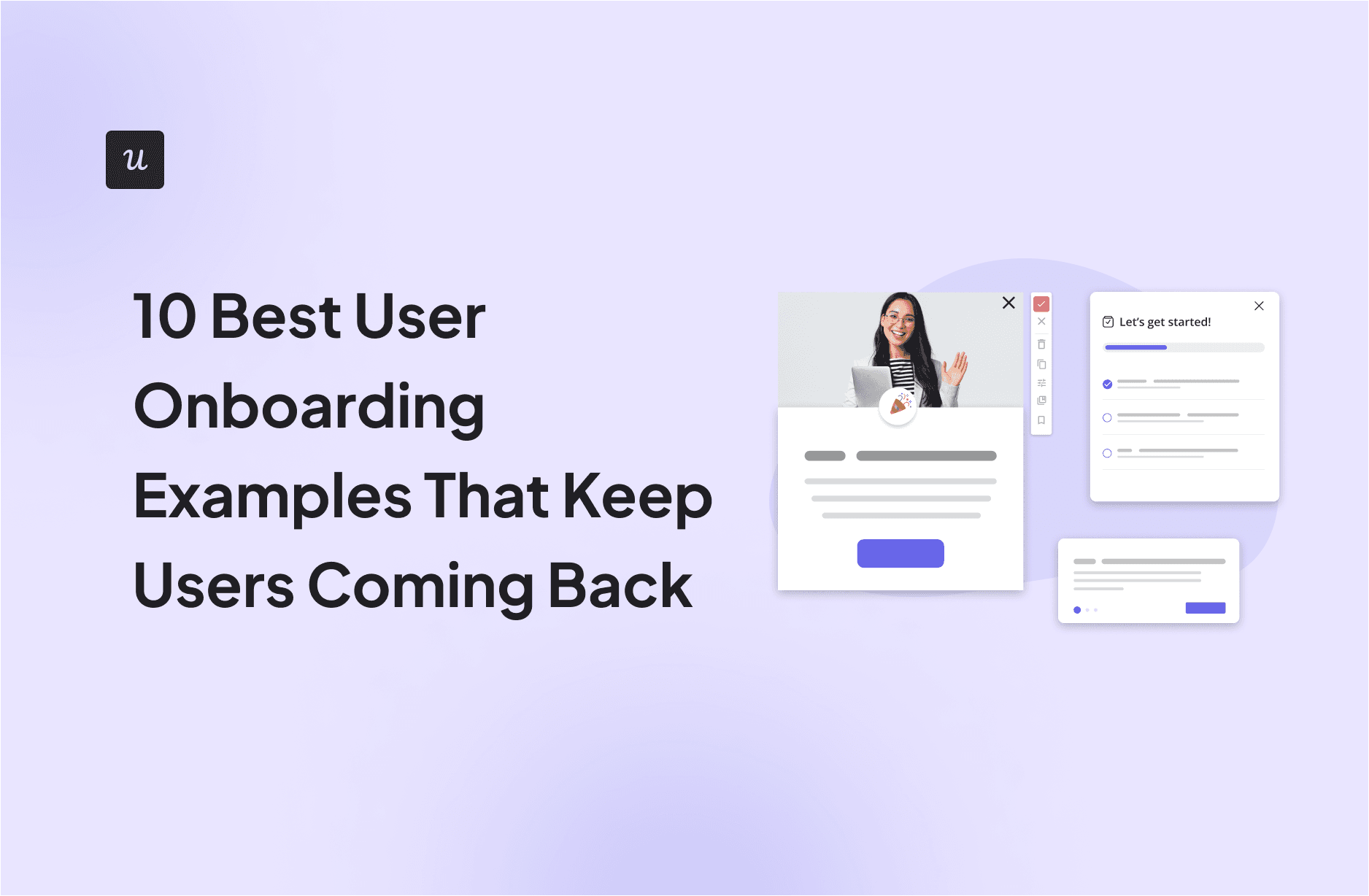
10 Best User Onboarding Examples That Keep Users Coming Back
Aug
Getting someone to sign up for a product is nice. Getting that same person to return tomorrow, next week, and three months from now is where the real magic happens.
That is why great user onboarding is not simply a digital tour guide pointing enthusiastically at every button. Nobody opens a new app hoping to spend the next ten minutes clicking “Next” through seventeen tooltips. Users arrive because they want something accomplished: schedule a meeting, design an image, improve their writing, organize a project, learn Spanish, or finally locate the file named “FINAL_final_v7_reallyfinal.pdf.”
The best onboarding experiences shorten the distance between signup and that first meaningful success. They use personalization, templates, checklists, interactive guidance, sensible defaults, progress indicators, and carefully timed education to make a complicated product feel surprisingly manageable.
Below are ten excellent user onboarding examples and, more importantly, the lessons product teams can borrow from them.
Research basis:
What Makes a Great User Onboarding Experience?
Successful onboarding is less about teaching every feature and more about helping a new user experience value quickly. Product-led growth experts often describe this as reaching an activation point or “aha moment”: the point where someone understands why the product deserves a place in their life or workflow.
Several patterns repeatedly appear in effective SaaS onboarding and mobile app onboarding:
- Fast time to value: Users accomplish something useful early.
- Personalization: The experience adapts to goals, roles, or intended use cases.
- Learning by doing: Users complete real tasks instead of merely watching demonstrations.
- Progressive disclosure: Advanced capabilities appear when they become relevant.
- Visible progress: Checklists, milestones, and completion states create momentum.
- Contextual guidance: Help appears near the action where users need it.
Think of onboarding as introducing someone to a large city. You do not begin by handing them the municipal zoning regulations. You show them where to get coffee, where they are going, and how not to accidentally board a train headed three counties away.
Research basis:
10 Best User Onboarding Examples
1. Slack: Get People Communicating Instead of Studying Slack
Slack demonstrates an important principle: onboarding should lead users toward the behavior that makes the product valuable.
New users are guided into a workspace built around channels, messages, collaboration, and team organization. Slack also provides templates that can accelerate workspace creation for specific purposes rather than forcing teams to construct everything from an intimidating blank canvas.
That matters because Slack’s value is not knowing where every preference lives. The value appears when colleagues begin communicating and information starts flowing through useful channels.
Why it works: Slack makes the core activityteam communicationthe destination of onboarding rather than turning setup into a separate educational event.
Lesson to copy: Determine the first behavior that predicts successful product adoption and design the onboarding flow around completing that behavior.
2. Notion: Personalization Before the Blank Page Panic
Notion can become a simple notes app, a project management system, a company knowledge base, a CRM, a content calendar, or something created by the office spreadsheet wizard after consuming too much espresso.
That flexibility creates an onboarding challenge: a completely empty workspace could leave newcomers wondering what exactly they are supposed to build.
Notion addresses this partly through templates and onboarding information. Its documentation notes that new users can receive template selections based on information provided during onboarding. Users can then begin with existing structures instead of inventing everything from scratch.
Why it works: Personalization reduces irrelevant choices while templates reduce setup effort.
Lesson to copy: If your product serves several audiences, ask a small number of useful questions early and use the answers to change what users see next.
3. Canva: Start Creating Before Becoming a Designer
Canva has an enormous feature set, yet its fundamental promise is refreshingly straightforward: help people create something that looks good.
Its template-driven experience gives users shortcuts into presentations, social graphics, documents, marketing materials, and numerous other formats. Canva also provides onboarding resources tailored to different team roles and encourages interactive exploration rather than requiring people to master the entire editor first.
This dramatically lowers the perceived difficulty of design work. Instead of beginning with a philosophical question such as “What should my 1080-by-1080 canvas contain?” users can start with a structure that already looks respectable.
Why it works: Templates create an immediate visual result and reduce blank-state anxiety.
Lesson to copy: Give new users a partially completed starting point whenever creating from zero involves substantial effort.
4. Duolingo: Turn Onboarding Into the Beginning of a Habit
Duolingo is one of the clearest examples of onboarding blending naturally into retention.
Rather than treating introductory setup as something completely separate from learning, the product quickly moves users toward actual language practice. Continued lessons feed into visible progress systems such as streaks. Duolingo describes its streak as a measurable representation of consecutive days spent learning.
This is clever because the user is not merely learning how Duolingo works. The user is already becoming the type of person who opens Duolingo regularly.
Why it works: Onboarding establishes a repeatable behavior, while progress systems give users a reason to maintain momentum.
Lesson to copy: If retention depends on repeated activity, introduce that activity during onboardingnot three emails later.
5. Grammarly: Demonstrate Value Inside the User’s Existing Workflow
Grammarly has historically benefited from one especially powerful onboarding advantage: users can experience the product while doing something they already dowriting.
After installing the browser extension or desktop experience, users encounter writing suggestions directly where they compose text. That means the product does not require them to abandon their normal workflow and spend twenty minutes inside a training playground called “WelcomeProject123.”
A misspelled word or awkward sentence can become the demonstration.
Why it works: Grammarly’s onboarding value appears contextually. The interface teaches users what the product does while the product is doing it.
Lesson to copy: Whenever possible, replace explanations with a real, useful result. A successful action is usually more persuasive than another tooltip saying, “This feature is very useful.”
6. Calendly: Build Toward One Obvious Win
Calendly has an exceptionally understandable user objective: create a scheduling setup that other people can use to book time.
A new user therefore does not need to understand every integration or team scheduling capability immediately. The important early steps revolve around configuring the account and booking page, setting scheduling preferences, and becoming ready to share availability.
The first successful booking creates a strong aha moment: instead of sending six messages containing variations of “Does Tuesday work?”, the calendar handles the negotiation.
Why it works: The onboarding journey has a concrete finish line connected directly to the product’s primary benefit.
Lesson to copy: Build your onboarding checklist around outcomes rather than administrative chores. “Share your booking page” feels more valuable than “Complete setup step four.”
7. Loom: Teach Recording by Getting People to Record
Video software can appear more complicated than it really is. There are cameras, microphones, screen permissions, recording controls, editing tools, links, and the lingering fear that you accidentally recorded five minutes of yourself looking for the Stop button.
Loom’s educational material emphasizes quickly recording and sharing an initial video, while its getting-started tutorials demonstrate the workflow visually.
This is a perfect match between teaching format and product behavior. Instead of explaining video communication with a massive wall of text, Loom can show the process through video and direct users toward creating one themselves.
Why it works: The onboarding action is almost identical to normal product usage.
Lesson to copy: Create an onboarding task that resembles what successful users will repeatedly do later.
8. Dropbox: Make the First Success Incredibly Concrete
Dropbox proves that onboarding does not need fireworks, confetti, a mascot, and a six-question personality quiz.
The product’s basic value can be demonstrated through extremely concrete actions: upload a file, organize it, sync it, or share it with another person. Dropbox’s current help documentation continues to place these straightforward actions at the center of getting useful work done.
Uploading something creates ownership inside the account. Sharing it demonstrates collaboration. Syncing demonstrates convenience across devices.
Why it works: Each early task creates a tangible result rather than teaching abstract functionality.
Lesson to copy: Find the smallest user-generated objectfile, document, project, campaign, playlist, reportthat makes the account feel useful and help the user create it quickly.
9. Asana: Use Structure to Tame a Powerful Product
Work management platforms face a classic onboarding problem: flexibility is wonderful after you understand the product and mildly terrifying before you do.
Asana tackles adoption with getting-started resources, workflows, onboarding guidance, and reusable templates. Templates are particularly useful because project management products become much easier to understand when users see actual tasks, owners, deadlines, and workflows instead of an empty project.
Rather than explaining every possible configuration, structured examples demonstrate how the pieces fit together.
Why it works: The product teaches through recognizable workflows instead of introducing isolated features one after another.
Lesson to copy: For complex B2B software, organize onboarding around jobs users want to accomplish, not around your navigation menu.
10. Intercom: Combine Product Tours With Contextual Checklists
Intercom has written extensively about user onboarding because it also builds tools designed to help companies create onboarding experiences.
Its approach emphasizes contextual product tours, personalization, interactive learning, activation, and checklists. The central idea is stronger than simply placing arrows over every corner of an interface: guide people toward meaningful product outcomes and adjust guidance according to what they need.
Intercom’s onboarding guidance also emphasizes identifying the user’s aha moment and connecting onboarding activity to measurable activation.
Why it works: Instead of assuming everyone needs an identical tour, contextual onboarding can respond to progress and user goals.
Lesson to copy: Your onboarding should behave more like a helpful coach than an airport loudspeaker repeating the same announcement to everyone.
What These User Onboarding Examples Have in Common
They Reduce Time to Value
Strong onboarding moves users toward a useful result quickly. Research and product analytics guidance increasingly focus on activation and time to value because early product success is closely connected with later retention.
They Avoid Teaching Everything at Once
Progressive disclosure is a long-established UX principle: show essential information first and introduce secondary complexity when it becomes relevant. This is particularly valuable for feature-rich products where displaying every capability immediately can make the interface resemble an aircraft cockpit.
They Let Users Learn by Doing
The strongest onboarding flows often make the first action an authentic product action. Users create, upload, schedule, communicate, write, record, or practice instead of simply consuming product education.
They Personalize With a Purpose
Personalization works best when collected information changes the experience. Asking someone’s job title, team size, favorite breakfast cereal, and childhood superhero is not personalization if every answer leads to exactly the same dashboard.
Ask only what helps you recommend a better starting point.
How to Improve Your Own User Onboarding Flow
Start by defining one activation event. For a scheduling product, that could be creating and sharing a booking link. For design software, it might be publishing a first design. For analytics software, it could be connecting a data source and viewing the first meaningful report.
Then work backward.
- Identify the user’s desired outcome.
- Define the smallest action that demonstrates that outcome.
- Remove unnecessary setup before that action.
- Provide templates or defaults when decisions create friction.
- Introduce advanced features only after basic value has appeared.
- Measure completion rate, activation rate, and time to value.
- Compare retention between users who complete key onboarding actions and those who do not.
- Continuously test where new users hesitate or abandon the flow.
Do not optimize onboarding completion merely because a dashboard says 87% of users clicked every checkbox. A user can complete a beautifully engineered seven-step tutorial and still have absolutely no idea why they should return.
The important question is whether onboarding produces behavior associated with lasting value.
Practical Experience: What Reviewing Great Onboarding Flows Teaches You
One of the most useful lessons from studying successful onboarding experiences is that impressive onboarding often feels surprisingly unimpressive while you are using it. That is a compliment.
When onboarding works properly, users rarely think, “What an extraordinary onboarding architecture.” They think, “Oh, that was easy.”
This creates an interesting challenge for product teams. During development, there is a temptation to demonstrate all the work that went into the product. Engineers built twelve remarkable features, marketing created six new capabilities, and somebody spent three months developing an AI button that glows beautifully. Naturally, everyone wants new customers to see everything immediately.
Users have a different agenda.
They usually signed up to solve one problem.
The most effective approach is therefore to remove rather than add. Every additional form field, modal, permission request, tooltip, video, and configuration option should earn its position in the first-session experience.
A useful exercise is to watch where a new user pauses. Hesitation reveals friction that experienced employees no longer notice. Product teams know what terms such as “workspace,” “instance,” “property,” “event,” or “collection” mean inside their application. A brand-new user may be wondering whether clicking the wrong option will summon the accounting department.
Templates are particularly powerful in these situations. Notion, Canva, Asana, and similar flexible tools demonstrate why. A populated example communicates relationships faster than a paragraph of instructions. Instead of explaining how projects, tasks, owners, and deadlines interact, you can let users see a working project and modify it.
Another recurring lesson is that onboarding should not necessarily end after the welcome checklist disappears. The first session is merely the beginning of product education.
A person who just created an account may need one core capability today and an advanced feature three weeks later. Showing that advanced feature during minute three wastes attention. Showing it immediately after the user reaches the situation where it becomes helpful feels almost magical.
This is where behavioral onboarding becomes more useful than a traditional linear tour. Guidance can respond to what someone has already completed, which features remain unused, and which outcome they appear to be pursuing.
Finally, good onboarding measurement requires resisting vanity metrics. Tutorial completion sounds encouraging, but activation is more meaningful. Activation is useful, but retention tells a deeper story. If people enthusiastically finish onboarding and disappear forever, the product team has created an excellent graduation ceremony for users who are leaving.
The practical goal is a chain of small successes: first value, second value, repeated value, and eventually habit. The best onboarding examples on this list work because they begin that chain without making the user feel as though they have enrolled in an online certification course about the software they just wanted to use.
Conclusion
The best user onboarding examples share a deceptively simple philosophy: help users succeed before asking them to understand everything.
Slack moves people toward communication. Notion and Canva reduce blank-page anxiety with templates. Duolingo connects onboarding with habit formation. Grammarly demonstrates its value inside existing workflows. Calendly creates a clear scheduling win. Loom encourages immediate creation. Dropbox makes value tangible through files and sharing. Asana adds structure to complexity, while Intercom demonstrates how contextual guidance can continue beyond a basic introductory tour.
If you are redesigning your own onboarding experience, resist the urge to begin with more tooltips. Begin with a question instead: What does a new user need to accomplish before they genuinely understand why this product matters?
Build the shortest, clearest path to that moment. Everything else can wait its turn.
Note: Product interfaces and onboarding flows evolve over time. The examples above focus on documented onboarding patterns and product behaviors available through 2026 rather than claiming that every screen or prompt remains visually identical across all accounts and platforms.

