Beauty Tools & Accessories
Paint Experts Reveal the Hottest Paint Colors of 2026
Jun
Every year, paint companies announce their “Color of the Year,” and every year homeowners quietly wonder: Is this actually useful, or is it just a fancy way to sell me another sample pot? For 2026, the answer is surprisingly useful. The hottest paint colors of 2026 are not random mood-board confetti. They point to a clear shift in American interiors: warmer neutrals, smoky greens, deep reds, quiet browns, creamy whites, and colors that look like they were borrowed from nature, old leather, pottery, moss, roasted coffee, and a very stylish hiking trail.
The big story is comfort with character. Cool gray is not completely gone, but it has definitely stopped being the main character. In its place, paint experts are leaning into grounded colors that feel calm, cozy, expressive, and livable. Think less “blank apartment wall” and more “home that knows how to make soup.”
Below, we break down the top paint color trends for 2026, how experts are using them, where they work best, and how to try them without accidentally turning your dining room into a cave or your hallway into a pickle jar.
Why 2026 Paint Colors Feel Warmer, Deeper, and More Personal
The 2026 paint color trends are responding to a simple design craving: people want homes that feel grounded. After years of crisp whites, icy grays, and ultra-minimal rooms, homeowners are choosing colors with warmth, texture, and emotion. Paint is being used to create atmosphere, not just cover drywall.
That does not mean every room needs to be dramatic. In fact, many of the best paint colors for 2026 are understated. Universal khaki, creamy ivory, ochre beige, soft eucalyptus green, smoky jade, and walnut brown all have a relaxed quality. They are not shouting, “Look at me!” They are saying, “Come in, sit down, and please ignore the laundry chair.”
Paint experts are also focusing on colors that pair well with natural materials. Wood cabinets, stone counters, woven shades, linen upholstery, terracotta tile, unlacquered brass, and vintage furniture all look better beside warmer, earthier wall colors. This is why 2026’s palette feels practical: it is made for real homes, not just catalog rooms where nobody owns charging cables.
The Hottest Paint Colors of 2026
1. Universal Khaki: The New Neutral With a Backbone
One of the biggest 2026 paint color stories is the rise of khaki, tan, and beige-brown neutrals. Sherwin-Williams selected Universal Khaki as its 2026 Color of the Year, and it perfectly captures the move toward warmer, more grounded interiors.
Universal Khaki works because it is not a flat beige. It has depth, an earthy undertone, and enough personality to make a room feel designed rather than default. It can support traditional furniture, modern organic interiors, farmhouse details, and even contemporary spaces with black metal, cream textiles, and warm wood.
Use it in living rooms, entryways, bedrooms, offices, and exterior siding. It is especially strong in rooms where you want a calm background that still feels current. Pair it with creamy white trim, deep green accents, chocolate brown furniture, black hardware, or muted burgundy textiles.
2. Silhouette: The Elegant Brown-Charcoal Hybrid
Benjamin Moore’s 2026 Color of the Year, Silhouette, brings a more dramatic mood to the trend conversation. It blends burnt umber with charcoal notes, creating a shade that sits somewhere between brown, black, and deep gray.
This is a smart color for homeowners who want drama without going full haunted mansion. Silhouette feels refined, layered, and luxurious. It is ideal for dining rooms, powder rooms, built-ins, libraries, accent walls, and bedroom feature walls. It can also make cabinetry look custom, especially when paired with marble, aged brass, or warm white walls.
The key is lighting. In a bright room, Silhouette may show more of its brown warmth. In a dim room, it can read deeper and moodier. Test a large sample before committing, unless your hobby is repainting at midnight while questioning every life choice.
3. Hidden Gem: Smoky Jade for Calm Energy
Behr’s 2026 Color of the Year, Hidden Gem, is a smoky jade that blends blue and green. It is one of the most versatile bold colors of the year because it feels both energizing and calm. That is a difficult balance to achieve, like drinking coffee while meditating.
Hidden Gem works beautifully on kitchen cabinets, bathroom vanities, laundry rooms, office walls, and exterior doors. It gives a space color without feeling childish or overly bright. Because it has a smoky quality, it pairs well with soft whites, warm woods, brushed nickel, matte black, and sandy neutrals.
For a modern look, use Hidden Gem on cabinets with white quartz or butcher-block counters. For a cozier style, pair it with walnut, aged brass, and cream walls. It is also a strong choice for renters who want a bold furniture makeover instead of painting an entire room.
4. Warm Eucalyptus: The Spa Green That Does Not Feel Sterile
Valspar’s Warm Eucalyptus is another important green for 2026. It is restorative, serene, and nature-inspired, but it does not feel cold. The shade lives in that soft green zone that makes bathrooms feel spa-like, bedrooms feel quiet, and kitchens feel connected to the outdoors.
Warm Eucalyptus is ideal for bedrooms, bathrooms, mudrooms, nurseries, guest rooms, and reading nooks. It also works well with vintage-inspired decor, pale woods, off-white textiles, and botanical prints.
If you are afraid of green, this is one of the easier ways in. It is less loud than emerald, less gray than old-school sage, and more interesting than a basic neutral. In a small bathroom, it can turn “toothbrush storage zone” into “tiny boutique hotel moment.”
5. Midnight Garden: Deep Green for Grown-Up Drama
Dunn-Edwards selected Midnight Garden as its 2026 Color of the Year, and the name tells you exactly what to expect. It is a deep, muted green with earthy undertones, the kind of color that makes a room feel calm, polished, and slightly mysterious.
This is a high-impact color for cabinets, accent walls, exteriors, libraries, bedrooms, and dining spaces. It is especially beautiful with natural wood, stone, cream trim, linen upholstery, and warm metallic finishes.
Deep green is popular because it delivers color and neutrality at the same time. It reads as bold, but because it is rooted in nature, it rarely feels trendy in the disposable sense. It is more “old garden gate” than “viral paint panic.”
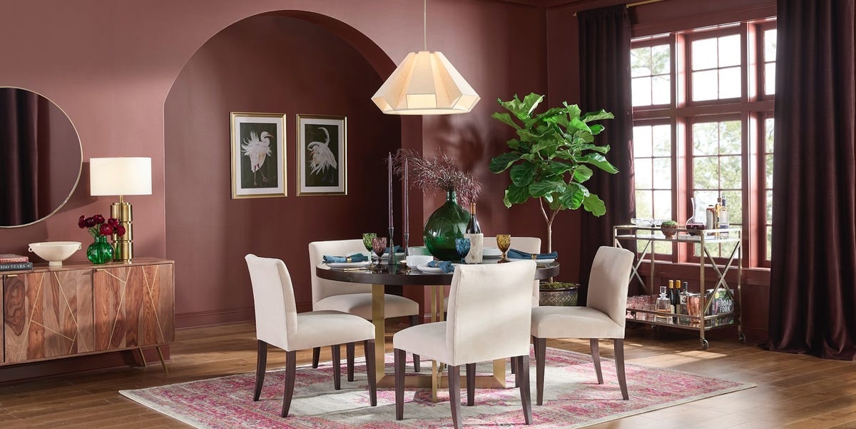
6. Warm Mahogany: Red Comes Back, But Smarter
Glidden’s Warm Mahogany shows that red is returning in a more grounded way. This is not the glossy cherry-red dining room of the early 2000s. Warm Mahogany is rich, earthy, and mature, with enough brown in it to feel timeless.
Use this color where you want warmth and intimacy: dining rooms, powder rooms, dens, entryways, and accent furniture. It can also look gorgeous behind bookshelves or on interior doors. Pair it with cream, camel, walnut, antique brass, deep green, or charcoal.
Red can be intimidating, but Warm Mahogany proves that warm colors do not have to scream. Sometimes they can simply clear their throat elegantly and make the room feel expensive.
7. Melodious Ivory: Creamy White With Soul
Dutch Boy’s 2026 Color of the Year, Melodious Ivory, represents another major paint color trend: soft, creamy whites. After years of stark white walls, homeowners are asking for whites that feel warmer, more nostalgic, and more forgiving.
Melodious Ivory is a smart choice for people who want a light room but do not want a clinical one. It works in living rooms, bedrooms, kitchens, hallways, and open-concept spaces. It is also a strong trim or ceiling color when paired with khaki, eucalyptus green, smoky jade, or warm brown.
Creamy whites are especially useful in older homes, where pure white can make original woodwork or vintage floors look yellow by comparison. A warmer ivory plays nicely with age, texture, and handmade details.
8. Epernay: Ochre Beige With European Charm
C2 Paint’s Epernay brings a refined ochre-beige tone into the 2026 palette. It feels sun-warmed, mineral, and slightly historic. Imagine limestone, champagne, and an old European building having a very sophisticated paint baby.
Epernay is excellent for dining rooms, bedrooms, sitting rooms, hallways, and spaces with vintage rugs or antique wood furniture. It gives warmth without the heaviness of brown and personality without the brightness of yellow.
Use it with terracotta, plum, deep green, creamy white, or dark bronze. It is also a lovely option for anyone who wants a neutral that does not look like it came free with the apartment lease.
9. Coffee Bean and Hazelnut Crunch: Brown Becomes Beautiful Again
Brown is having a serious comeback in 2026. Krylon’s Coffee Bean and Clark+Kensington’s Hazelnut Crunch both show how deep, earthy browns are moving from background furniture finishes to front-and-center design colors.
These shades work because they make rooms feel warm and stable. Use them on furniture, doors, trim, cabinets, accent walls, and small spaces that benefit from a cocoon effect. Brown looks especially good with cream, olive, rust, muted blue, soft pink, and natural wood.
The trick is contrast. Pair brown walls or cabinetry with lighter textiles, reflective hardware, woven textures, or pale flooring. Otherwise, the room can start to feel like a chocolate bar wrapper, which sounds delicious but may not be the design goal.
10. Divine Damson: Plum-Red for the Bold but Sensible
Graham & Brown’s Divine Damson adds another rich, wine-toned option to the 2026 color mix. It is deep, elegant, and dramatic, with plum and red undertones that make it feel luxurious without becoming flashy.
This color is best in rooms where mood matters: dining rooms, bedrooms, powder rooms, lounges, and creative spaces. It pairs well with antique gold, warm white, dark wood, olive green, and soft blush.
Divine Damson is not for the commitment-phobic. But if you want one room in your house to feel like it has a velvet jacket and excellent stories, this is your color family.
Major 2026 Paint Color Trends Experts Are Watching
Earthy Neutrals Replace Cold Gray
The biggest trend is the move from cool gray to warm neutrals. Khaki, taupe, mushroom, camel, ivory, beige, ochre, walnut, and coffee tones are becoming the new foundation colors. They make homes feel softer and more welcoming, especially when paired with natural materials.
Greens Stay Strong, But They Get Moodier
Green is still one of the most important interior paint colors for 2026, but the trend is shifting away from pale sage alone. Smoky jade, eucalyptus, deep garden green, and gray-green tones are leading the way. These greens are calm enough for everyday living but colorful enough to make a room memorable.
Reds and Plums Return as Accent Colors
Warm Mahogany, Divine Damson, oxblood, burgundy, and burnt red are part of a broader return to emotional color. These shades are perfect for rooms that benefit from intimacy and drama. They also work well in small doses, such as painted furniture, interior doors, trim, or a single accent wall.
Color Drenching Evolves Into Gradient Layering
Color drenching remains popular, but experts are also embracing gradient layering. Instead of painting walls, trim, ceiling, and built-ins the exact same shade, designers use several related tones from one color family. For example, a bedroom might combine soft eucalyptus walls, a deeper green closet door, and creamy ivory trim. The result feels layered, intentional, and less flat.
How to Use 2026 Paint Colors in Real Homes
Start With the Room’s Purpose
Before picking a color, decide how the room should feel. Bedrooms usually benefit from softer greens, creamy whites, khaki neutrals, and muted browns. Dining rooms can handle deeper reds, plum tones, and charcoal-browns. Kitchens work beautifully with smoky jade, warm ivory, deep green, and walnut accents. Home offices often look best in colors with focus and depth, such as Silhouette, Epernay, or Hidden Gem.
Test Paint in Daylight and Artificial Light
A paint color can look completely different at 8 a.m., 2 p.m., and 9 p.m. This is especially true for 2026’s complex colors, which often have layered undertones. A smoky jade may look greener in daylight and bluer at night. A khaki neutral may look beige in one room and olive in another. Always test large swatches before buying gallons.
Use Bold Colors Where They Make Sense
You do not need to paint your entire house deep plum to prove you are stylish. Use bold colors strategically. Try Warm Mahogany in a powder room, Hidden Gem on a vanity, Midnight Garden on built-ins, or Coffee Bean on a vintage dresser. Small projects let you enjoy trend colors without turning your home into a paint showroom with Wi-Fi.
Pair Warm Colors With Texture
The best 2026 interiors are not just about paint. They are about paint plus texture. Warm neutrals look better with linen, wool, cane, rattan, wood, stone, ceramic, leather, and woven baskets. Deep greens and browns look richer with brass, marble, aged wood, and matte finishes. Creamy whites look less plain when layered with art, books, plants, and textiles.
Best 2026 Paint Colors by Room
Living Room
Choose Universal Khaki, Melodious Ivory, Epernay, or Warm Eucalyptus for a living room that feels welcoming and flexible. Add darker accents through furniture, trim, or built-ins.
Kitchen
Hidden Gem and Midnight Garden are excellent for cabinets. Melodious Ivory works well on walls, while Universal Khaki can create a cozy, modern backdrop. Pair these shades with natural wood, stone counters, and simple hardware.
Bedroom
For a restful bedroom, consider Warm Eucalyptus, Melodious Ivory, Universal Khaki, or a softened brown. If you want more drama, use Silhouette behind the bed and keep bedding light.
Bathroom
Bathrooms are perfect for experimenting. Warm Eucalyptus feels spa-like, Hidden Gem feels polished, and Divine Damson or Warm Mahogany can make a powder room unforgettable.
Home Office
Try Epernay, Silhouette, Midnight Garden, or Coffee Bean. These colors create focus and depth without the harshness of plain white walls.
Common Mistakes to Avoid With 2026 Paint Trends
The first mistake is choosing a trend color only because it is popular. A color still has to work with your floors, furniture, counters, lighting, and personal taste. The second mistake is ignoring undertones. Warm neutrals can lean yellow, green, pink, or brown. Greens can lean blue, gray, or olive. Test first, celebrate later.
The third mistake is using the wrong finish. Flat paint can look elegant on low-traffic walls, but satin or semi-gloss is usually better for trim, cabinets, bathrooms, and furniture. The fourth mistake is skipping prep. Even the trendiest color cannot save a wall with dust, dents, or mystery bumps from 1997.
Real-Life Experience: What It Feels Like to Decorate With 2026’s Hottest Paint Colors
In real homes, the 2026 paint palette feels less like a trend report and more like a permission slip. It gives homeowners permission to stop chasing perfect white walls and start building rooms with mood, warmth, and personality. The most noticeable change is how forgiving these colors are. A creamy ivory wall can make mismatched furniture feel intentional. A khaki neutral can calm down a busy open-concept space. A smoky green cabinet color can make a basic kitchen look custom without requiring a second mortgage and a dramatic renovation montage.
One of the most useful experiences with these colors is learning that “neutral” no longer means boring. Universal Khaki, Epernay, Hazelnut Crunch, and Coffee Bean all function as neutrals, but they bring depth. In a living room with a beige sofa, a warm khaki wall can add structure. In a bedroom with thrifted wood furniture, a creamy ivory can make everything feel soft and collected. In a hallway, a brown-black door color can make builder-basic trim look surprisingly expensive. Paint is doing the quiet work of tying everything together.
Another practical discovery is that greens are easier to live with than many people expect. Warm Eucalyptus and Hidden Gem may look bold on a small paint chip, but once they are on cabinetry or a bathroom wall, they often feel calm. Green has a built-in relationship with plants, wood, daylight, and outdoor views, so it tends to settle naturally into a room. If a homeowner is nervous, the best first project is a vanity, dresser, interior door, or laundry room. These small spaces give the color room to shine without demanding total commitment.
The richer reds and plums require more confidence, but they can be incredibly rewarding. Warm Mahogany or Divine Damson in a powder room creates instant atmosphere. Guests may not remember your hand soap, but they will remember the room. These colors also work beautifully in dining spaces because they flatter warm lighting, candles, wood tables, and evening gatherings. The key is balance: pair dramatic walls with simple art, warm whites, and natural textures so the room feels elegant instead of theatrical.
The biggest lesson from using 2026 paint colors is that sampling matters. A color that looks perfect online can shift dramatically once it meets your actual lighting. North-facing rooms may make colors look cooler. South-facing rooms can intensify warmth. LED bulbs can exaggerate undertones. Before painting, place large samples on different walls and observe them throughout the day. Yes, this step is slightly annoying. It is also much less annoying than buying five gallons of the wrong green and pretending you meant to live inside a pea.
Overall, the hottest paint colors of 2026 are popular because they feel human. They are imperfect in the best way: earthy, layered, warm, a little nostalgic, and deeply livable. They work with old furniture, new furniture, inherited furniture, and that one chair nobody likes but everyone keeps. Whether you choose creamy ivory, smoky jade, deep garden green, warm mahogany, or a khaki neutral, the goal is not to copy a trend exactly. The goal is to create a home that feels calmer, richer, and more like you.
Conclusion
The hottest paint colors of 2026 reveal a clear design direction: warmth is back, nature is still powerful, and homeowners want rooms with emotional depth. Paint experts are moving toward colors that feel grounded and expressive at the same time. Universal Khaki, Silhouette, Hidden Gem, Warm Eucalyptus, Midnight Garden, Warm Mahogany, Melodious Ivory, Epernay, Coffee Bean, Hazelnut Crunch, and Divine Damson all tell different parts of the same story.
If you want a safe update, start with creamy ivory, khaki, or ochre beige. If you want calm color, try eucalyptus, smoky jade, or deep green. If you want drama, explore mahogany, damson, charcoal-brown, or coffee tones. And if you want the smartest advice of all, test before you paint. Your walls have opinions, and lighting is their lawyer.
In 2026, the best paint color is not just the one experts recommend. It is the one that makes your space feel more comfortable, more intentional, and more alive.
