Beauty Unlocked
Decorating with BOLD Colors
Jun
Decorating with bold colors is a little like walking into a party wearing a red velvet blazer: terrifying for the first five seconds, unforgettable for the rest of the night. For years, many homes were wrapped in safe neutralswhite walls, beige sofas, gray rugs, and the occasional “wild” navy throw pillow. Lovely? Sure. Risky? About as risky as ordering vanilla ice cream in a paper cup.
But bold color is back, and it is not here to whisper politely from the corner. Saturated blues, emerald greens, ruby reds, mustard yellows, deep aubergines, coral oranges, and dramatic blacks are finding their way onto walls, ceilings, cabinets, furniture, rugs, and even trim. The result is a home that feels layered, expressive, and deeply personal instead of showroom-staged and emotionally unavailable.
The good news is that decorating with bold colors does not mean turning your living room into a box of spilled crayons. The best colorful interiors are intentional. They use balance, contrast, lighting, texture, repetition, and a little restraint. Think of bold color as hot sauce: the right amount makes everything better; too much, and suddenly everyone needs milk.
Why Bold Colors Work So Well in Home Decor
Bold colors create instant personality. A saturated wall color can make a plain room feel designed, a painted ceiling can make a bedroom feel cocoon-like, and a bright accent chair can wake up a neutral living room faster than a double espresso.
Color also affects how a room feels. Deep greens can create a grounded, nature-inspired mood. Rich blues can feel calm and elegant. Warm terracotta, paprika, and orange tones can make a space feel sunny and welcoming. Jewel tones such as sapphire, emerald, amethyst, and ruby add drama without necessarily feeling chaotic. These colors are powerful because they do more than decorate; they set the emotional temperature of the room.
Another reason bold colors work is contrast. A cobalt cabinet against white tile, a burgundy sofa in a cream room, or a mustard velvet chair beside dark wood creates visual tension in the best way. Your eye has somewhere to go. The space feels alive.
Start with a Color Story, Not a Color Accident
The secret to decorating with bold colors is not bravery. It is planning. Before buying paint, pillows, wallpaper, rugs, curtains, and a neon-orange lamp named “Greg,” decide what kind of story the room should tell.
Ask yourself: Should the space feel energetic, cozy, elegant, playful, moody, fresh, vintage, tropical, or dramatic? A bold yellow kitchen tells a different story than a forest-green dining room. A hot-pink powder room says, “I have confidence and possibly excellent snacks.” A navy bedroom says, “Please let me sleep like royalty.”
Once the mood is clear, choose a main color, a supporting color, and one or two accent colors. A simple palette might include deep teal walls, warm camel upholstery, brass hardware, and ivory curtains. Another could include raspberry accents, chocolate brown furniture, creamy walls, and black picture frames. The more specific the palette, the less likely the room will look like it was decorated during a power outage.
Use the 60-30-10 Rule as a Helpful Starting Point
The classic 60-30-10 color rule remains popular because it gives structure to colorful decorating. In a typical room, about 60 percent of the palette is the dominant color, 30 percent is the secondary color, and 10 percent is the accent color.
For example, in a living room, the dominant 60 percent might be soft warm white walls and a large neutral rug. The 30 percent might be a deep green sofa and curtains. The 10 percent might be coral pillows, art, and a ceramic lamp. The room feels colorful, but not confusing.
Of course, design rules are more like recipes than laws. You can adjust the ratio. A maximalist room might use several bold colors more evenly. A minimalist home might use one dramatic accent color against a quiet backdrop. The point is not to obey math with trembling hands. The point is to keep the eye from feeling attacked.
Try Color Drenching for a Dramatic, Sophisticated Look
Color drenching means painting walls, trim, doors, and sometimes the ceiling in the same color or closely related shades. It can sound intense, but the effect is often surprisingly elegant. Instead of chopping the room into separate visual pieces, one continuous color creates a smooth, enveloping atmosphere.
This works especially well with deep blues, smoky greens, warm browns, burgundy, charcoal, plum, or muted terracotta. In a dining room, color drenching can make dinner feel like an event even when the meal is Tuesday leftovers. In a small office, it can create focus. In a bedroom, it can feel cozy and restful.
The trick is to choose a color with depth rather than a harsh primary shade. A moody olive or inky blue usually feels easier to live with than pure fire-engine red on every surface. Finish also matters. Using different sheensmatte on the walls, satin on the trimcan add subtle dimension without adding another color.
Small Spaces Are Perfect for Big Color
If you are nervous about decorating with bold colors, start in a smaller area. Powder rooms, entryways, mudrooms, laundry rooms, closets, stair landings, and pantries are excellent places to experiment. These spaces are used briefly, so they can handle more drama than a room where you spend five hours watching documentaries and pretending not to scroll your phone.
A tiny powder room can become a jewel box with peacock-blue walls, patterned wallpaper, and brass lighting. A hallway can become memorable with a red runner and gallery wall. A laundry room can feel cheerful with sunny yellow cabinets or a graphic wallpaper. These “confidence zones” help you test your taste without committing the entire house to one loud decision.
Balance Bold Color with Neutrals That Actually Belong
Bold colors need breathing room. Neutrals are not boring when they are used well; they are the supporting actors that let the star perform. Warm whites, creams, taupes, soft grays, mushroom tones, natural linen, black, and wood finishes can keep a colorful room grounded.
The key is matching undertones. A warm terracotta looks better with cream, camel, walnut, and brass than with icy white and chrome. A cool cobalt blue may pair beautifully with crisp white, charcoal, pale gray, and polished nickel. If undertones clash, the room can feel slightly “off,” like a song being played on a piano that has not been tuned since 1998.
Natural materials also help balance strong colors. Wood, rattan, stone, leather, linen, wool, and clay soften saturated palettes. A deep purple room with velvet, walnut, and warm lighting feels luxurious. The same purple room with flat lighting and cheap plastic accessories may feel like a haunted arcade.
Decorate with Bold Colors Without Painting
Paint is powerful, but it is not the only way to bring bold color into a home. Renters, commitment-phobes, and people still emotionally recovering from a bad lime-green bedroom in middle school have plenty of options.
Use Rugs as Color Anchors
A colorful rug can set the entire palette for a room. Look for rugs with several shades you can repeat in pillows, art, lamps, or curtains. A rug with navy, rust, cream, and olive gives you a ready-made design plan. It also covers the floor, which is useful if your flooring has “landlord special” energy.
Add Color Through Artwork
Large-scale artwork is one of the easiest ways to introduce bold color. A bright abstract painting above a sofa can make a neutral living room feel intentional. Choose one or two colors from the artwork and repeat them elsewhere so the piece feels connected rather than randomly dropped into the room like a surprise guest.
Choose Statement Furniture
A bold sofa, painted cabinet, lacquered side table, or colorful dining chair can become the focal point of a space. If the furniture is expensive, choose a color you genuinely love, not a shade you liked for three minutes while standing under fluorescent store lighting.
Layer Pillows, Throws, and Curtains
Textiles are the easiest low-risk way to test a bold palette. Pillows, throws, bedding, curtains, and table linens can be swapped seasonally. A neutral bedroom can become warm and dramatic with rust velvet pillows and a deep green quilt. A white sofa can look fresh with cobalt, citron, and black patterned cushions.
Use Pattern Carefully with Bold Colors
Bold color and bold pattern can absolutely live together, but they need a referee. If you use a highly colorful floral wallpaper, keep some furniture solid. If your sofa is bright velvet, choose a rug with a quieter pattern. If everything is colorful and patterned at the same intensity, the room may start vibrating visually.
A reliable strategy is to vary pattern scale. Pair a large floral with a small stripe, a medium geometric, or a subtle texture. Repeating colors across patterns helps them feel related. For example, a room with emerald curtains, a blue-and-green rug, and pillows with small touches of emerald will feel collected rather than chaotic.
Solids are also your friend. A solid bold color can be easier for the eye to process than five competing prints. This is especially useful in bedrooms and living rooms, where comfort matters as much as style.
Do Not Forget the Ceiling
The ceiling is often called the fifth wall, which is a fancy way of saying, “Hello, there is a giant surface above your head doing absolutely nothing.” Painting the ceiling a bold or slightly deeper shade can transform a room.
In a dining room, a deep blue ceiling can make the space feel intimate. In a nursery or child’s room, a soft but saturated sky blue or warm peach can feel playful. In a hallway, a painted ceiling can create a sense of movement. For a subtle approach, use a color one or two shades lighter or darker than the wall color.
Color capping, a newer paint idea, uses related shades from the same color family across walls, trim, and ceiling. The effect is layered and polished, especially in rooms with crown molding or architectural detail.
Match Bold Colors to the Room’s Function
Not every bold color belongs in every room. A high-energy citrus orange may be fantastic in a breakfast nook but too stimulating in a bedroom. A dark aubergine might make a lounge feel glamorous but could make a windowless hallway feel like the entrance to a very stylish cave.
For bedrooms, consider rich but restful colors such as navy, forest green, muted plum, dusty rose, or warm chocolate. For kitchens, cheerful colors like blue, green, yellow, or terracotta can work beautifully on cabinets, islands, or backsplashes. For dining rooms, dramatic shades such as oxblood, deep teal, charcoal, or olive can create atmosphere. For bathrooms, bold wallpaper, saturated tile, or colorful vanities can turn a practical space into a design moment.
Test Paint Before Committing
Bold paint colors can change dramatically depending on light. Natural daylight, warm bulbs, cool LEDs, shadows, and nearby finishes all affect how a color appears. A paint chip that looks elegant in the store may look alarmingly different on your wall at 8 p.m.
Always test large swatches in the actual room. Look at them in the morning, afternoon, and evening. Hold them near your flooring, furniture, cabinets, countertops, and fabrics. This step is not glamorous, but it is much cheaper than repainting an entire room because your “sophisticated coral” became “traffic cone smoothie.”
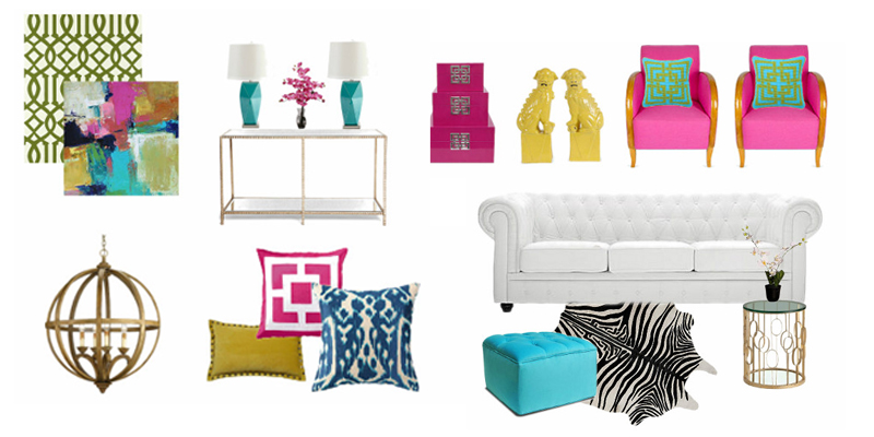
Bold Color Combinations That Actually Work
Some bold color combinations are classics because they balance contrast and harmony. Navy and mustard feel tailored and warm. Emerald and blush feel elegant without being too sweet. Teal and rust feel modern but earthy. Burgundy and olive feel rich and old-world. Cobalt and white feel crisp and energetic. Chocolate brown and raspberry feel surprisingly chic. Black and saffron can feel dramatic when softened with wood and cream.
The best combinations usually share a level of depth. Jewel tones often work well together because they have similar richness. Earth tones work because they feel grounded. Pastels can support bold colors when they soften the overall look. When in doubt, use one bold color as the hero and let the others play supporting roles.
Common Mistakes When Decorating with Bold Colors
Mistake 1: Using Too Many Unrelated Colors
A colorful room should feel collected, not accidental. Repeat colors in at least three places to make them look intentional. For example, if you use a coral chair, repeat coral in artwork, a pillow, or a vase.
Mistake 2: Ignoring Lighting
Lighting can make bold colors sing or sulk. Add layered lighting with overhead fixtures, lamps, sconces, and accent lighting. Warm bulbs can flatter reds, oranges, yellows, and browns. Cooler light can sharpen blues, greens, and grays.
Mistake 3: Choosing Trend Over Taste
Trends are useful for inspiration, but your home should not look like it was decorated by an algorithm wearing loafers. Choose colors you enjoy living with, not just colors currently dominating social media.
Mistake 4: Forgetting Texture
A bold room without texture can feel flat. Add velvet, boucle, linen, wood, woven shades, ceramic lamps, metallic finishes, and natural fibers. Texture gives color depth and keeps the room from feeling like a painted cardboard box.
How to Make Bold Colors Feel Timeless
Bold color can be timeless when the room is built with quality, balance, and personality. Avoid decorating the entire space around one trendy shade. Instead, pair bold colors with classic silhouettes, durable materials, and meaningful objects.
A deep green library with wood shelves, brass lighting, and a leather chair will age beautifully. A cobalt kitchen island with marble counters and simple hardware can feel fresh for years. A ruby-red rug in a neutral room can be swapped later, but while it is there, it gives the room soul.
Timeless bold design also depends on editing. A colorful home still needs quiet moments. Negative space, simple shapes, and neutral pauses allow strong colors to feel elegant instead of exhausting.
Personal Experiences and Practical Lessons from Decorating with Bold Colors
The first lesson many people learn about decorating with bold colors is that courage usually arrives after the first brushstroke. Before that, the paint can look suspicious. You open the can, stare into a pool of dark green, berry red, or peacock blue, and suddenly wonder if you have made a financial and emotional mistake. Then the color goes on the wall, the room changes, and you realize the old beige was not “calm.” It was just tired.
One of the most useful experiences is starting with a small but visible area. An entryway, for example, can handle a dramatic color because it is transitional. Painting an entry a saturated blue or deep olive creates an immediate welcome. Guests step inside and understand that the home has a point of view. The color does not need to match every room exactly, but it should connect through undertones, artwork, flooring, or repeated accents.
Another lesson is that bold color looks better when it has company. A red chair alone in a gray room can feel random, like it wandered in from another house. But add a piece of art with a touch of red, a patterned pillow with a similar tone, and maybe a small red book or vase, and suddenly the chair looks intentional. Repetition is the magic trick. It tells the eye, “Do not panic. We planned this.”
Lighting is also more important than most beginners expect. A dramatic navy wall can look rich during the day and almost black at night. That is not necessarily bad, but it needs warm lamps, reflective surfaces, and lighter accents to stay inviting. In rooms with limited natural light, bold colors can still work, but they need texture and glow. A dark wall with a mirror, brass sconce, velvet chair, and cream lampshade feels layered. The same wall with one ceiling bulb feels like an interrogation room with taste.
It is also wise to test bold colors near the furniture that will actually stay in the room. A color can be beautiful on its own and wrong beside your sofa. Undertones are sneaky. A green with yellow undertones may clash with a blue-gray couch. A red with blue undertones may fight with orange wood floors. Sampling is not a delay; it is insurance.
Finally, bold decorating becomes easier when you stop trying to impress everyone. Some guests will love your emerald dining room. Some will prefer beige. That is fine. A home should reflect the people who live there, not an imaginary committee of cautious relatives. The best bold interiors feel personal, joyful, and lived-in. They do not scream for attention; they speak clearly. Sometimes they speak in teal. Sometimes in plum. Occasionally, if the powder room is involved, they sing opera in hot pink.
Conclusion: Let Bold Color Make Your Home Feel Alive
Decorating with bold colors is not about being reckless. It is about being expressive with intention. Whether you paint an entire room in moody green, add a sapphire sofa, hang dramatic wallpaper in a powder room, or simply bring in a bold rug, color can make your home feel more memorable, personal, and alive.
The best approach is to start with a clear mood, build a thoughtful palette, test colors in real light, repeat accents, and balance saturated shades with texture and neutrals. Bold color does not have to overwhelm a home. When used well, it gives every room a pulse.
So go ahead. Try the deep blue. Buy the mustard pillow. Paint the cabinet plum. Your home does not need to be louder than your personality, but it should at least know how to hold a conversation.
