
Beauty Tools & Accessories
Sweet Shop: A Paris Designer with a Penchant for Pastels
Aug
Some designers walk into a room and ask, “Where should the sofa go?” A Paris designer with a true penchant for pastels asks a far more dangerous question: “Would this corner be happier in coral, porcelain gray, or the color of a strawberry macaron that has read poetry?” That is the charming world suggested by Marika Giacinti, the artist, illustrator, and graphic designer behind the former home decor label Marika Giacinti Paris. Her work proves that pastel interior design does not have to look like a baby shower escaped into the living room. Done well, it can feel refined, handmade, travel-worn, and quietly witty.
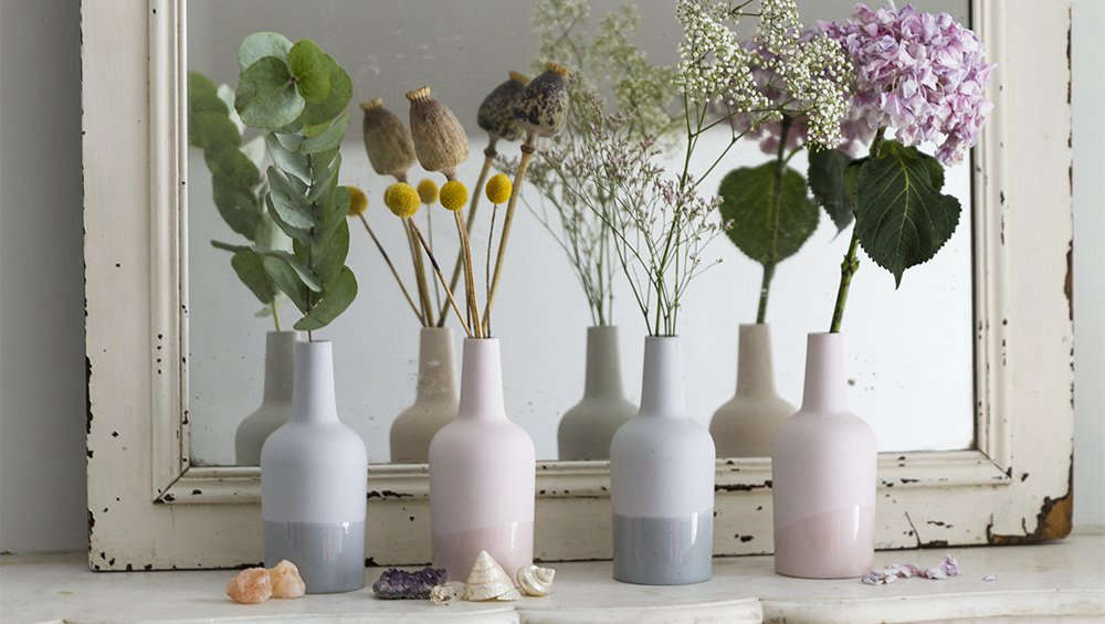
The phrase Sweet Shop: A Paris Designer with a Penchant for Pastels sounds like a candy counter, but the sugar here is visual. Think delicate porcelain vessels, linen cushions in blush and coral, soft Liberty-style fabrics, hand-dyed textiles, and small decorative objects that look as if they have been collected from a poetic weekend between Paris, Ghent, Lisbon, and Kyoto. It is not maximalism shouting through a megaphone. It is softness with a backbone, which, frankly, is the best kind of softness.
A Pastel World with Parisian Discipline
Pastels are often misunderstood. In the wrong hands, pale pink, mint, peach, powder blue, and butter yellow can become flat, sentimental, or aggressively “cute.” In the right hands, they become atmosphere. Giacinti’s approach sits in that more sophisticated category. Her designs have the lightness associated with Parisian apartments: airy rooms, casually arranged objects, vintage hints, pale textiles, and pieces that look collected rather than “installed.”
What makes her pastel home decor memorable is the balance between sweetness and restraint. A coral cushion does not need to scream when it is paired with a simple gray porcelain vase. A small pot can feel important when it is placed on a mantel beside books, a branch, or a ceramic bottle. The colors are soft, but the compositions are deliberate. This is the difference between a room that whispers and a room that mumbles.
Her visual language also reflects her background in art and graphic design. Graphic designers understand spacing, contrast, scale, and the quiet drama of a well-placed shape. In Giacinti’s collections, cushions are not only cushions. They are ovals, rectangles, tassels, pom-poms, lines, and color blocks arranged with the eye of someone who knows that negative space is not empty; it is breathing room.
Who Is Marika Giacinti?
Marika Giacinti is an artist, illustrator, and designer associated with Paris and Ghent. Around 2012, she launched Marika Giacinti Paris, a small home decor company focused on decorative pillows, porcelain pieces, cups, stationery, and other carefully designed objects. The label was active through several collections, with handmade and limited-run pieces that carried a personal, travel-inspired quality.
Her home decor work was never about mass-market perfection. Instead, it celebrated the particular: the slight irregularity of porcelain, the texture of washed cotton gauze, the romance of hand-dyed linen, and the joy of fabrics that feel like they have stories tucked into the seams. Her Collection No. 4, for example, included porcelain vessels made in Portugal and cushions with a “grandmother chic” moodalthough, to be fair, this is the sort of grandmother who knows where to buy excellent espresso and owns better shoes than you do.
The Design Ingredients: Porcelain, Linen, and a Little Mischief
Porcelain Vessels with Quiet Personality
Porcelain is a natural partner for pastel interiors. It has a milky, luminous quality that allows pale colors to feel intentional rather than washed out. Giacinti’s porcelain vases and petit pots leaned into simple forms: small bottles, cups, and vessels that could hold flowers, tea, pencils, or absolutely nothing at all. The last option is important. A beautiful object does not always need a job. Sometimes its job is simply to sit there and look composed while the rest of us answer emails.
In modern interiors, ceramics have become more than functional tableware. Designers and collectors increasingly treat handmade ceramics as small sculptures. They add texture, craft, and human warmth to rooms dominated by smooth screens, sleek cabinets, and factory-straight lines. A gray porcelain bottle on a shelf can soften a room the way a good scarf softens an outfit: quietly, immediately, and without asking permission.
Cushions That Refuse to Be Background Actors
The cushions in Giacinti’s world are not merely accessories tossed onto a sofa because a magazine said “layer your textiles.” They are the characters. A hand-dyed coral linen cushion brings warmth. A washed gauze cushion with tassels adds texture. A pom-pom trim gives the whole arrangement a wink. Together, they create a room that looks lived in, but not chaotic; playful, but not unserious.
This is one of the smartest ways to decorate with pastels. Instead of painting every wall pale pink and hoping for emotional stability, start with textiles. Pillows, throws, bedding, curtains, and table linens let pastel colors enter the home gradually. They are easier to move, replace, or rotate with the seasons. In other words, a blush cushion is a commitment; a blush kitchen remodel is a subplot.
Grandmother Chic, But Make It Paris
The phrase “grandmother chic” has had a remarkable comeback in interior design. Think florals, pleats, ruffles, embroidered details, vintage ceramics, soft colors, and old-fashioned forms used with a modern eye. Giacinti’s work fits beautifully into that conversation because it does not imitate the past literally. It borrows comfort from it.
A cushion with tassels can feel nostalgic, but when it is made in a fresh pastel tone and placed beside a clean-lined porcelain vase, it becomes contemporary. A floral fabric can feel traditional, but in a restrained palette it becomes airy rather than fussy. This is the trick: do not copy grandma’s parlor; borrow her confidence. She knew a good trim when she saw one.
Why Pastel Interior Design Still Feels Fresh
Pastel interior design has survived many trend cycles because soft color is useful. A pale shade can behave almost like a neutral while still offering more personality than plain white. Soft blue can calm a bedroom. Peach can warm a dark corner. Mint can brighten a kitchen. Lavender can make a reading nook feel slightly dreamy, as though the books are about to start offering advice.
Recent design conversations have also moved away from sterile minimalism and toward homes with emotional texture. People want rooms that feel personal, handmade, and comforting. Pastels support that mood when they are paired with natural materials such as wood, linen, stone, cane, rattan, clay, and aged metal. The best pastel rooms are not sugary from floor to ceiling. They are layered with grounding elements that keep them adult.
That is why Giacinti’s work remains inspiring. She uses pastel colors as part of a larger design language, not as a gimmick. Her soft tones sit beside porcelain, cotton, linen, and vintage-leaning silhouettes. The result feels collected and human, not algorithmically adorable.
How to Bring the “Sweet Shop” Look Home
Start with One Pastel Hero
The easiest way to achieve a Parisian pastel home decor look is to choose one hero color. It might be coral pink, chalky blue, pale peach, dusty lilac, butter yellow, or gray-green. Let that color appear in two or three places: a cushion, a vase, a lampshade, a piece of art, or a small dish on a bedside table.
Repeating a pastel shade gives a room rhythm. But resist the urge to match everything too perfectly. A home should not look as if it was attacked by a swatch card. Slight variation is what makes the palette feel natural.
Ground Soft Colors with Texture
Pastels become sophisticated when they meet texture. Pair a blush pillow with raw wood. Place a pale porcelain vase on a stone mantel. Mix mint with woven cane, peach with linen, powder blue with aged brass, or lavender with a rough ceramic bowl. Texture prevents pale colors from floating away into decorative marshmallow territory.
Use White Carefully
White walls can make pastels glow, but too much bright white can also make them feel thin. Warmer whites, ivory, cream, and soft beige often work better with pastel home accessories. They create a more forgiving background and help the palette feel lived-in rather than showroom-clean.
Add One Oddball
Every sweet room needs one strange note. It might be a black frame, a dark wood chair, a surreal illustration, a chrome tray, a striped textile, or a funny little ceramic object you cannot quite explain to guests. Pastels love contrast. Without it, they can become too polite. And a room that is too polite is basically a waiting room with better lighting.
The Paris-Ghent Influence: Travel as a Design Tool
Giacinti’s decorative work was described as travel-inspired, and that matters. Travel gives interiors depth because it brings together objects that do not come from the same shelf, catalog, or shopping afternoon. A porcelain piece made in Portugal, a cushion named for Kyoto, a fabric with an English floral spirit, and a Parisian apartment setting can all coexist when they share a mood.
This is one of the great lessons of European-inspired interior design: cohesion does not have to mean sameness. A room can be calm even when its objects come from different places. The secret is editing. Choose pieces that share softness, scale, tactility, or color temperature. Then give them space. Parisian design often looks effortless because it knows when to stop. American design lovers, who have access to carts, closets, garages, and overnight shipping, may find this emotionally challenging.
Pastels and the Modern Craft Movement
The renewed interest in handmade ceramics, small-batch textiles, and imperfect materials is part of a larger desire for homes with character. Mass-produced decor can be convenient, but handmade objects carry evidence of touch. A slight variation in glaze, a hand-dyed textile, or a cushion with an unusual silhouette gives a room something no trend forecast can fake: presence.
Pastels fit naturally into this craft movement because they highlight material. A pale glaze reveals the shape of a vessel. A soft pink linen shows wrinkles beautifully. A gray ceramic cup makes the morning coffee feel more intentional, even if the drinker is still wearing mismatched socks and negotiating with the toaster.
Specific Styling Examples Inspired by the Look
The Pastel Mantel
Place two small porcelain vessels on a mantel, one in pale gray and one in white. Add a single branch, a slim candle, and a small framed drawing. Then introduce a coral or peach cushion on the nearest chair. The eye connects the objects without the arrangement feeling forced.
The Soft Sofa
Start with a neutral sofa in cream, oatmeal, or warm gray. Add three cushions: one oval blush linen cushion, one square pale blue cotton cushion, and one patterned floral cushion with a tiny trim. Keep the coffee table simple with a ceramic dish and a stack of books. The look is charming, not cluttered.
The Bedside Pastel Moment
On a bedside table, use a small porcelain cup as a catchall for earrings, matches, or the tiny mysteries that accumulate near beds. Add a pale yellow lampshade or a soft peach notebook. The room gains color without losing calm.
The Kitchen Shelf
Open shelving can become messy quickly, but a limited pastel palette helps. Mix white dishes, pale gray ceramics, one mint cup, and a small vase. Add a folded linen towel in blush or butter yellow. Suddenly the shelf looks styled, not like a cupboard having a nervous breakdown.
Why This Look Works for Small Spaces
Pastels are especially useful in small apartments because they add personality without visual heaviness. A dark dramatic palette can be beautiful, but it requires confidence and often excellent lighting. Pastels are more forgiving. They reflect light, soften corners, and make small rooms feel considered.
Parisian apartments are famous for making small spaces feel elegant through proportion, editing, and charm. The “sweet shop” approach borrows from that tradition. Instead of filling a tiny room with many loud elements, it uses a few tactile pieces: a linen cushion, a porcelain vase, a delicate print, a soft throw. The effect is intimate rather than crowded.
Common Mistakes When Decorating with Pastels
Mistake One: Making Everything Sweet
A pastel room needs contrast. Add wood, black accents, stone, metal, or a darker color to keep the palette grounded. Otherwise, the room may start to resemble a frosted cupcake with utilities.
Mistake Two: Ignoring Texture
Flat pastel paint plus flat pastel furniture plus flat pastel accessories equals visual oatmeal. Mix linen, cotton, ceramic, glass, wool, cane, and paper. Texture is what turns pale color into atmosphere.
Mistake Three: Buying Too Much at Once
The Giacinti-inspired look is collected, not dumped from a shopping bag in one dramatic afternoon. Add pieces slowly. Let the room tell you what it needs. Rooms are surprisingly chatty when you stop forcing them to become Pinterest boards.
Experience Notes: Living with a Pastel, Handmade Home
There is a particular pleasure in living with pastel decor that does not announce itself too loudly. The experience is less about creating a “theme” and more about building small rituals. A pale porcelain cup on a desk can change the mood of the workday. A coral cushion on a reading chair can make the chair more inviting. A soft blue dish by the door can hold keys and make the daily chaos look, if not elegant, at least supervised.
The best experience related to the “Sweet Shop” style is learning how much impact small objects can have. You do not need to repaint the entire apartment or replace every piece of furniture. In fact, the look often works better when the foundation is simple. A neutral sofa, wood floors, white or cream walls, and a few vintage pieces create the perfect stage for pastel accents. Add one handmade vase and the room begins to shift. Add two cushions and the room starts smiling. Add too many, and the room may begin selling macarons out of the window, so proceed with dignity.
Pastel design also changes with daylight. Morning light makes peach and pink feel fresh. Afternoon light warms butter yellow and coral. Evening lamplight gives pale gray porcelain a quiet glow. This is why handmade pieces are so rewarding: they respond to light differently throughout the day. A glossy factory object may look the same at 8 a.m. and 8 p.m.; a ceramic vessel with a soft glaze has moods. Honestly, relatable.
Another enjoyable part of this style is the way it invites mixing old and new. A modern pastel cushion can sit on an antique chair. A thrifted tray can hold a contemporary porcelain pot. A floral textile can live beside a minimalist lamp. This blend prevents the room from feeling staged. It says, “I have taste,” without also saying, “Please do not sit anywhere.”
For renters, the pastel sweet shop approach is especially practical. Since many rental homes limit painting, drilling, or renovation, portable decor becomes powerful. Cushions, throws, ceramics, trays, art prints, and lampshades can transform a room without angering the landlord, which is always a noble design goal. A small pastel palette can make a temporary space feel personal and polished.
For homeowners, the experience can go deeper. Pastels can be introduced through tile, cabinetry, painted furniture, wallpaper, or upholstery. A pale blue pantry, a blush powder room, or a peach guest bedroom can feel timeless when paired with quality materials. The key is choosing muted, slightly dusty versions of pastel colors rather than overly bright candy tones. Sophisticated pastels look as though they have lived a little. They have paid bills. They own linen napkins.
Ultimately, living with this style is about permission: permission to use color gently, to enjoy decorative objects, to value handmade imperfections, and to let a home be charming without becoming childish. Marika Giacinti’s pastel world reminds us that design can be sweet and serious at the same time. A room can have pom-poms and still possess taste. A porcelain pot can be tiny and still matter. A cushion can be soft and still carry the whole conversation.
Conclusion: The Lasting Charm of a Pastel Sweet Shop
Sweet Shop: A Paris Designer with a Penchant for Pastels is more than a pretty phrase. It captures a design philosophy built on softness, craft, color, and restraint. Marika Giacinti’s work shows how pastel interior design can feel worldly rather than sugary, handmade rather than precious, and playful without losing sophistication.
Her decorative pillows, porcelain vessels, and travel-inspired objects offer a useful lesson for anyone decorating a home: small pieces matter. A room does not always need a grand renovation. Sometimes it needs one coral cushion, one gray porcelain vase, one floral textile, and enough confidence to let them shine. Pastels, when balanced with texture and edited with care, can bring warmth, humor, and elegance into everyday spaces. That is the real sweetness.
Note: This article is an original, fully rewritten synthesis based on real design information about Marika Giacinti Paris, pastel interior design, handmade ceramics, textile styling, French-inspired decor, and current home decor best practices. No external source links or citation placeholders are embedded in the article body.

