Body Care
Neutra House Numbers
Jun
Some home upgrades shout. Others whisper politely, adjust their glasses, and make the whole front entry look ten times smarter. Neutra House Numbers belong to the second group. They are small, sculptural address numbers inspired by the clean geometry of modernist architecture, and they prove that even the digits on your wall can have better design manners than most people at a dinner party.
At first glance, house numbers seem purely practical. They help guests find the right door, delivery drivers avoid awkward porch confusion, and emergency responders locate your home quickly. But the best exterior details do more than function. They set the tone. A front door with thoughtful address numbers tells visitors, “Yes, someone here owns a level and perhaps even uses coasters.” Neutra-style numbers bring that quiet confidence through crisp lines, generous spacing, and a mid-century modern personality that feels timeless rather than trendy.
What Are Neutra House Numbers?
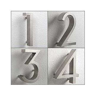
Neutra House Numbers are modern address numbers associated with the design language of Richard Neutra, the Austrian-American architect known for sleek, light-filled homes that helped define California modernism. The well-known retail version, often called Neutra Modern House Numbers, is rendered from the Neutraface font family and manufactured in materials such as anodized aluminum or brass-plated aluminum. The result is a set of exterior numbers that feels architectural, not decorative in the fussy sense.
Unlike generic hardware-store numerals, Neutra numbers are designed with proportion, shadow, legibility, and building style in mind. They often mount slightly off the wall, creating a floating effect. That small gap adds depth, casts a subtle shadow, and keeps the design from looking flat. It is the visual equivalent of good posture.
The Design Story Behind the Numbers
Richard Neutra’s work focused on clarity, human comfort, indoor-outdoor living, and careful integration with the surrounding landscape. His famous projects, including the Lovell Health House in Los Angeles and the Kaufmann Desert House in Palm Springs, show the same values people now associate with mid-century modern design: strong lines, open views, functional beauty, and a refusal to add unnecessary fluff.
The typeface connection matters. Neutraface, developed by House Industries, was inspired by the geometry and warmth of Neutra’s architecture. When those letterforms become physical house numbers, they carry more than a style. They carry an architectural idea: make the object useful, readable, balanced, and handsome without begging for applause.
Why Neutra House Numbers Work So Well
They Are Minimal, But Not Boring
Minimal design can go wrong when it becomes cold or anonymous. Neutra House Numbers avoid that problem because their geometry has personality. The shapes are clean, but the curves and proportions keep them approachable. They look especially at home on mid-century ranch houses, modern townhomes, stucco exteriors, wood siding, concrete walls, and renovated bungalows that want a sharper first impression.
They Improve Curb Appeal Immediately
Curb appeal is often discussed as if every homeowner has a weekend, a wheelbarrow, and the emotional strength to redesign the entire front yard. In reality, one of the easiest upgrades is replacing tired address numbers. New numbers can refresh a front entry faster than painting a door, installing landscaping, or explaining to your neighbor why their inflatable holiday penguin is still up in April.
Neutra-style house numbers create a polished focal point near the entrance, on a mailbox post, beside a garage, or on a front wall. Because the design is simple, it pairs well with other exterior elements: matte black lighting, brushed metal door hardware, natural wood, stone, brick, and minimalist planters.
They Balance Style With Visibility
Good address numbers must be attractive, but they also need to be readable from the street. Many residential codes require address identification to be plainly visible, legible, and contrasting against the background. In many areas, numbers are expected to be at least four inches high, though local rules can vary. This is where Neutra numbers make practical sense. Their clean sans serif forms are easier to read than ornate scripts or overly decorative fonts.
Choosing the Right Size
Size is not just a design choice; it is a visibility choice. A compact entryway close to the sidewalk may look great with four-inch numbers. A house set farther back from the street often needs six-inch numbers or larger. If your home sits behind a deep lawn, long driveway, gate, or heroic hedge situation, go bigger. Tiny numbers on a distant wall are not mysterious. They are just unhelpful.
As a simple rule, choose numbers that can be read easily from the most common viewing point: the sidewalk, curb, driveway entrance, or street. Step outside at different times of day and look at the surface where you plan to mount them. If you have to squint, delivery drivers will too. And they are already carrying three boxes, a scanner, and the weight of modern logistics.
Best Finishes for Neutra House Numbers
Black Finish
Black Neutra house numbers are bold, graphic, and extremely versatile. They work beautifully on white siding, pale stucco, natural wood, light brick, concrete, and warm neutral exteriors. Matte or satin black gives a modern edge without feeling flashy. It is often the safest choice when you want strong contrast.
Aluminum Finish
Anodized aluminum offers a lighter, more industrial look. It pairs well with glass, concrete, steel railings, gray siding, and contemporary architecture. Aluminum numbers can look especially refined on dark surfaces, where their soft metallic tone catches light without becoming shiny in a “tiny billboard” way.
Brass or Warm Metal Finish
Brass-plated or warm metal house numbers bring a softer, more luxurious feel. They are excellent for homes with warm wood doors, bronze lighting, beige stucco, olive paint, terracotta, or desert-modern landscaping. Brass works best when repeated elsewhere, such as in the door handle, mailbox, sconce, or planter details. One brass accent is nice. Five coordinated brass accents say, “This was intentional.”
Where to Install Neutra House Numbers
Beside the Front Door
The classic placement is beside the front door, usually near eye level. This works well for homes where the entry is visible from the street. Mounting numbers vertically on a narrow trim area can look stylish, especially on mid-century homes with strong vertical posts or beams.
On a Front Wall or Porch Column
A porch column, stucco wall, or wood accent panel can turn address numbers into a small architectural feature. For best results, leave enough breathing room around the digits. Neutra numbers look strongest when they are not crowded by doorbells, security cameras, wreath hooks, or that one mystery cable nobody wants to remove.
On a Mailbox, Gate, or Driveway Marker
If your house is not clearly visible from the road, consider placing the numbers closer to the street on a mailbox, gate post, fence panel, or freestanding address plaque. This is especially useful for long driveways, rural lots, or homes with heavy landscaping. The front door can still have numbers for style, but the street-facing marker does the practical work.
Installation Tips for a Clean Result
Most modern house numbers install with screws, studs, anchors, spacers, or adhesive systems depending on the product and wall surface. Neutra-style numbers often use mounting hardware and a template to help align the digits correctly. Do not skip the template. Freehand spacing sounds brave until the number 7 is floating away from the rest of the address like it has personal goals.
Before drilling, tape the template in place and step back. Check the alignment from the sidewalk and from the front approach. Use a level, measure twice, and confirm that the numbers are not too close to trim edges or light fixtures. If installing on brick, stone, tile, or stucco, use the correct drill bit and anchors. Masonry is not impressed by optimism.
Floating installation creates a refined shadow line, but it also requires careful spacing. Make sure every digit sits at the same depth from the wall. Uneven shadows can make expensive numbers look accidentally homemade, and not in the charming sourdough way.
How to Style Neutra Numbers With Different Home Exteriors
Mid-Century Modern Homes
Neutra House Numbers are a natural match for mid-century modern homes. Pair them with globe lights, low-slung planters, wood slat screens, terrazzo, breeze blocks, or a bold front door color. The numbers reinforce the architecture without turning the house into a theme restaurant called “The Atomic Ranch Café.”
Contemporary Homes
On contemporary homes, Neutra numbers bring order and clarity. They look sharp against smooth stucco, fiber cement siding, metal panels, and concrete. For a high-contrast look, use black numbers on a pale surface or aluminum numbers on charcoal siding.
Traditional Homes
Can Neutra numbers work on a traditional house? Yes, if the rest of the entry has been simplified. A colonial or craftsman home with modern lighting, updated hardware, and clean landscaping can handle modern numbers beautifully. The trick is balance. If the porch has ornate railings, carved trim, and vintage lanterns, a serif or classic plaque may feel more natural. But if the house is being refreshed with modern touches, Neutra numbers can bridge old and new.
Maintenance and Durability
Exterior numbers deal with sun, rain, dust, pollen, sprinklers, fingerprints, and the occasional spider who believes the number 8 is prime real estate. Aluminum and brass-plated finishes are generally low maintenance, but they still deserve gentle cleaning. Wipe them with a soft cloth and mild soap when needed. Avoid abrasive pads or harsh cleaners, especially on plated or anodized finishes.
Check the mounting hardware once or twice a year. If a number feels loose, tighten it before it tilts. A crooked digit may not ruin curb appeal, but it does give the front entry a slightly tipsy expression.
Common Mistakes to Avoid
Poor Contrast
Beautiful numbers are useless if nobody can see them. Black numbers on dark brick, silver numbers on pale gray siding, or brass numbers on tan stucco may disappear from the curb. Choose contrast first, finish second.
Mounting Too Low or Too High
Numbers should be easy to spot naturally. If visitors have to look at their shoes or crane their necks, the placement needs adjusting. Eye-level placement is often best near an entry, while street-facing installations should be positioned for drivers and pedestrians.
Ignoring Night Visibility
House numbers that look great at noon may vanish after sunset. Place them near an exterior light, choose a lit address plaque, or add landscape lighting if needed. Night visibility is not only convenient; it can matter during emergencies.
Using the Wrong Scale
A large façade can swallow small numbers. A tiny porch can be overwhelmed by giant digits. Match the number size to the wall, viewing distance, and architectural scale. The goal is confident, not shouty.
Are Neutra House Numbers Worth It?
For homeowners who care about design details, Neutra House Numbers are absolutely worth considering. They cost more than basic stick-on numbers, but they also deliver more presence, durability, and architectural character. They are especially valuable when you want a small upgrade that makes the front entry look more finished.
Think of them as exterior jewelry, but the useful kind. They do not merely decorate the house; they identify it, guide people to it, and quietly suggest that the rest of the home may also be thoughtfully designed. That is a lot of work for a few digits.
Conclusion
Neutra House Numbers are proof that small design choices can carry serious visual weight. Inspired by modernist architecture and shaped by clean typographic principles, they bring clarity, balance, and curb appeal to a home’s exterior. Whether mounted beside a front door, floated on a stucco wall, placed on a driveway marker, or paired with modern lighting, they make an address feel intentional.
The best choice depends on visibility, contrast, scale, finish, and placement. Pick numbers large enough to read from the street, choose a finish that stands out against the background, and install them with careful spacing. Do that, and your address will no longer look like an afterthought. It will look like part of the architecture.
Experience Notes: Living With Neutra House Numbers
One of the most common experiences homeowners have with Neutra House Numbers is surprise. The project seems almost too small to matter. You order a few digits, open the package, hold them against the wall, and suddenly the front entry looks unfinished without them. That is the funny thing about thoughtful design: once you see the difference, the old version starts looking like it was wearing sweatpants to a wedding.
During installation, the biggest lesson is usually patience. The numbers themselves may be simple, but alignment matters. A homeowner replacing basic builder-grade numbers might tape up the mounting template, step back, adjust it, step back again, call someone else outside for an opinion, and then adjust it one more time because the porch light is playing tricks. This is normal. Good placement is part measuring, part design instinct, and part refusing to let a crooked “2” haunt you forever.
Another real-world observation is how much the background changes the final look. Black Neutra numbers on a white wall feel crisp and graphic. Aluminum numbers on dark wood feel calm and architectural. Brass-toned numbers near warm lighting feel polished and welcoming. The same address can take on a completely different mood depending on the surface. That is why it helps to test the finish in daylight and at night before committing.
Homeowners also notice practical improvements. Delivery drivers find the house faster. Guests stop texting, “I think I’m outside?” Emergency visibility improves when the numbers are large, high-contrast, and well lit. It is not glamorous, but it matters. A beautiful address marker should still do the basic job of being an address marker. Design that cannot be read from the curb is just expensive camouflage.
The floating effect is often the detail people appreciate most after installation. When the numbers sit slightly away from the wall, the shadow gives them dimension. In morning or late-afternoon light, that shadow can make the address look custom, even if the rest of the porch is still waiting for its grand makeover. It is a small architectural moment, and small architectural moments are the secret sauce of curb appeal.
Maintenance is usually easy, but outdoor conditions matter. In dusty climates, a quick wipe keeps the finish sharp. In rainy or coastal areas, checking the mounting hardware occasionally is smart. If sprinklers hit the wall, redirect them to avoid mineral spots. Neutra House Numbers do not require pampering, but they do reward basic care.
The best experience comes when the numbers feel connected to the whole entry. Pair them with a modern sconce, a clean mailbox, a simple planter, or a freshly painted door, and the upgrade looks deliberate rather than random. Neutra House Numbers are not loud, but they have presence. They say the home is organized, stylish, and easy to find. Honestly, that is more than many GPS apps can promise.
